界面组件 UI Components
角标 Badge
角标用于提示用户重要消息,例如新消息、用户未查看消息、App 更新等。 角标分为默认角标和数字角标。默认角标提醒用户有新消息,数字角标提醒用户最新消息或物品数量。
适用情况
- 仅在告知用户数量极为重要的情况下,使用数字角标。
- 角标数字应小于三位数 (最多显示 99+)。
不适用情况
- 角标大小和颜色不一。
- 数字角标遮挡过多图标区域。
- 一个视图中含三个或三个以上角标。
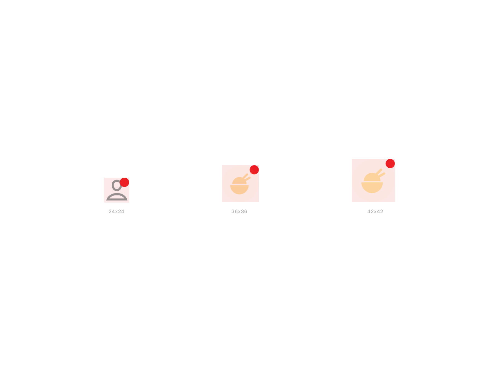
默认角标
默认角标提示用户自上次查看信息以来的新增信息。
<up-badge>
	<div class="box"></div>
</up-badge>
import {Badge} from 'up-qp-dls';

<Badge>
	<Icon name='sys_coupons'/>
</Badge>
数字角标
数字角标提示用户最新消息或物品数量。以购物车角标为例,角标数字提醒用户购物车添加的商品数量。
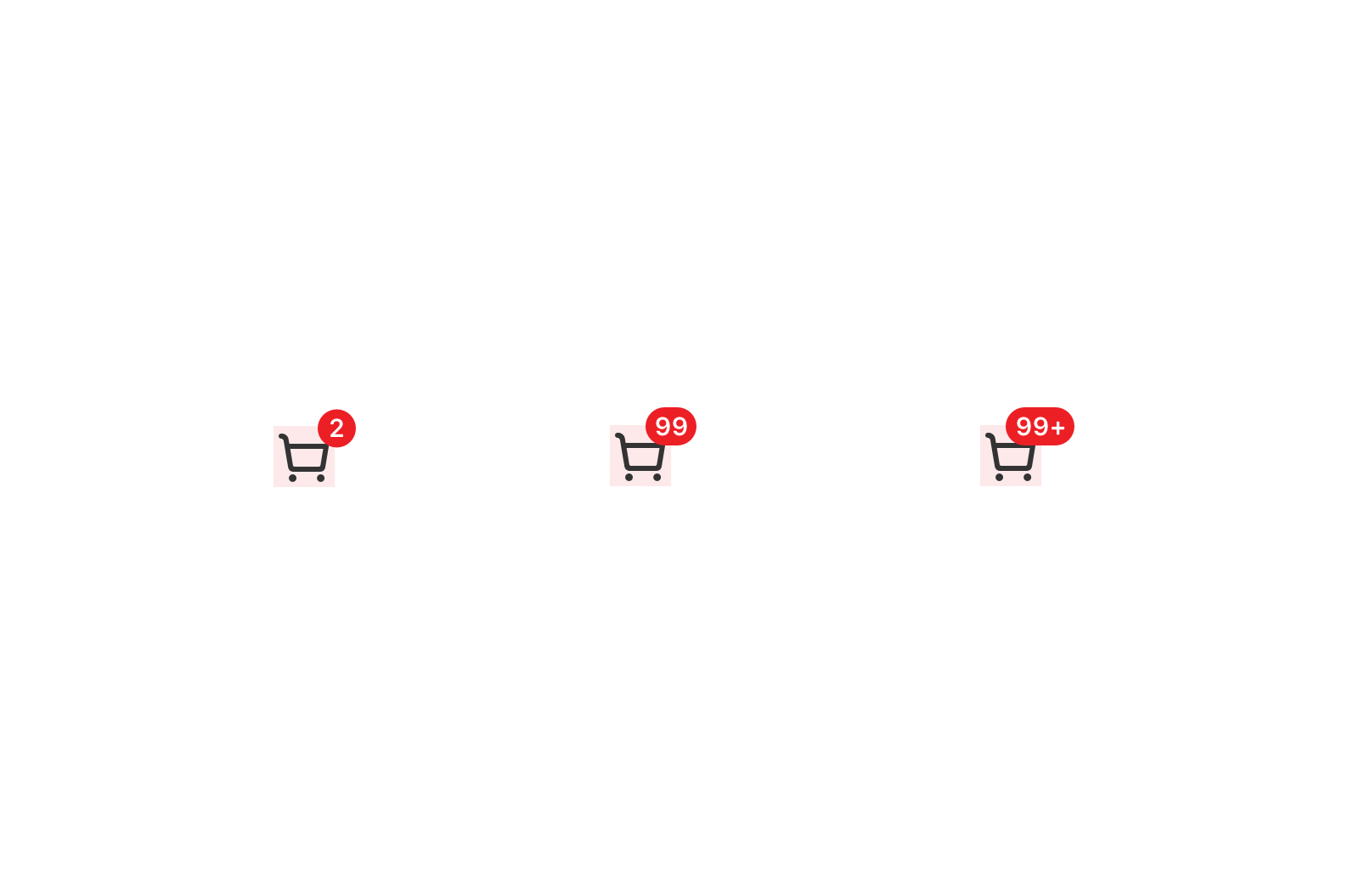
<up-badge type="number" :number="2">
	<up-icon color-class="has-text-gray" name="up_iconsys_shopping" ></up-icon>
</up-badge>

<up-badge type="number" :number="99">
	<up-icon color-class="has-text-gray" name="up_iconsys_shopping" ></up-icon>
</up-badge>

<up-badge type="number" :number="888">
	<up-icon color-class="has-text-gray" name="up_iconsys_shopping" ></up-icon>
</up-badge>
import {Badge} from 'up-qp-dls';

<Badge type='number' count={2}>
	<Icon name='sys_coupons' />
</Badge>
<Badge type='number' count={99}>
	<Icon name='sys_coupons' />
</Badge>
<Badge type='number' count={349}>
	<Icon name='sys_coupons'/>
</Badge>
Vue.js Reference
| 属性 | 说明 | 类型 | 可选值 | 默认值 |
|---|---|---|---|---|
| type | 角标类型 | String | default,number |
default |
| number | 数字角标的具体数值 | Number | - | - |
* .box为使用者自身元素,角标会放在右上角
React Native Reference
| 属性 | 说明 | 类型 | 可选值 | 默认值 |
|---|---|---|---|---|
| type | 角标类型 | String | dot,number |
dot |
| number | 数字角标的具体数值 | Number | - | - |