界面组件 UI Components
按钮 Button
按钮代表着一个即时操作命令,响应用户点击行为,触发相应的业务逻辑。
适用情况
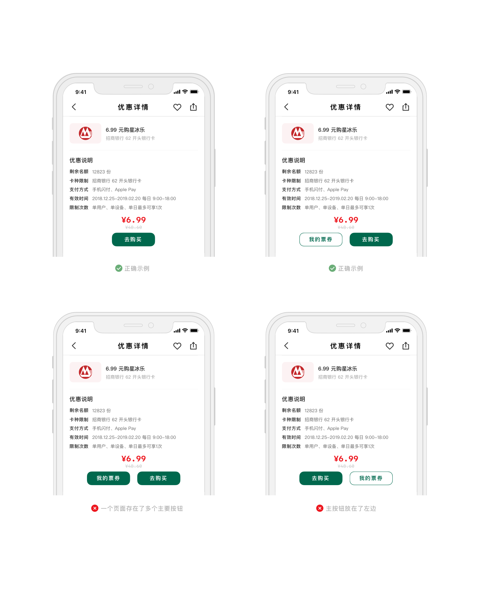
- 页面通常只有一个主要按钮,按钮应位于显眼位置,给予用户明确的操作指引。非主要操作的功能应使用次要按钮,同一页面至多可以有一到两个次要按钮,通常位于主按钮的旁边。
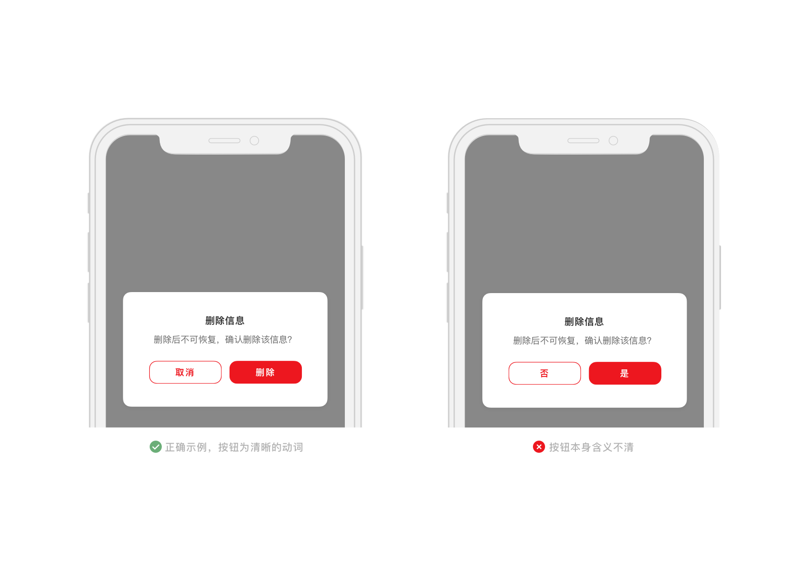
- 请使用简短的动词作为按钮名称,如「添加」、「删除」,避免使用「是」、「否」这类非动词词语;在不影响表达的情况下,尽量精简按钮文字,并且结合上下文语境,方便用户理解。
不适用情况
- 页面按钮太多(大于三个)且主次不分。
- 随意修改按钮大小形状,在不同界面中不统一。
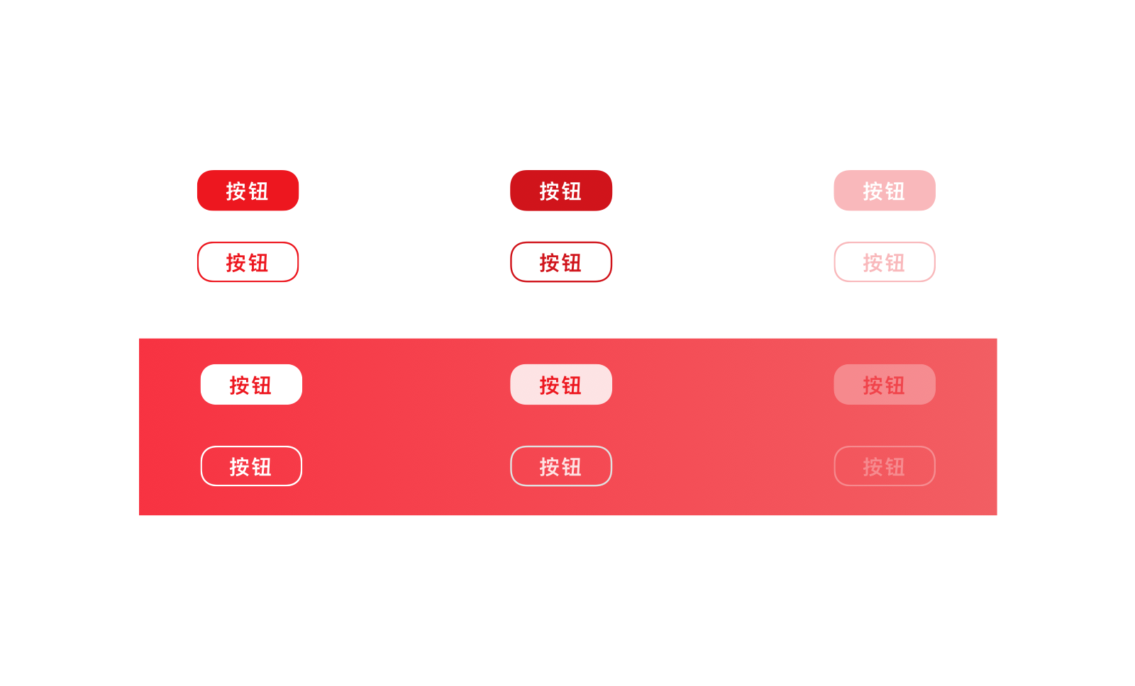
主要按钮
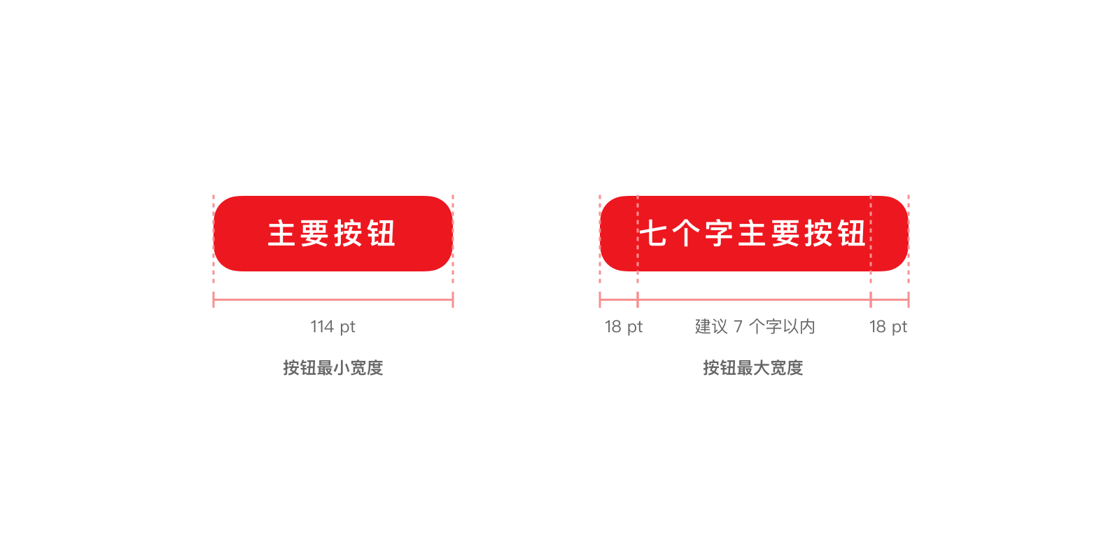
主要按钮是界面中最重要的用户操作,只用于界面中优先级最高的操作,吸引用户的注意。当出现多于一个按钮的按钮组合时,只允许使用至多一个主要按钮,且主要按钮放置在按钮组合的最右侧。
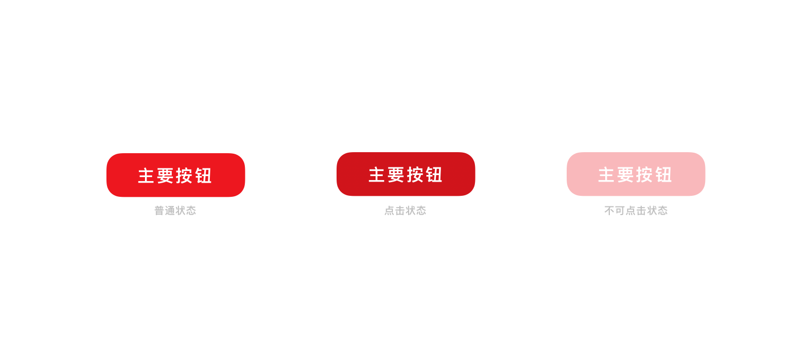
主要按钮文字应当尽量精简,推荐为 2 到 4 个字。 为避免视觉过度拥挤,主要按钮中最多使用 7 个文字。
<up-button type="primary">主要按钮</up-button>
<up-button type="primary" disabled>主要按钮</up-button>
import {Button} from 'up-qp-dls';

<Button title='主要按钮' type='primary'/>
<Button title='主要按钮' type='primary' disabled />
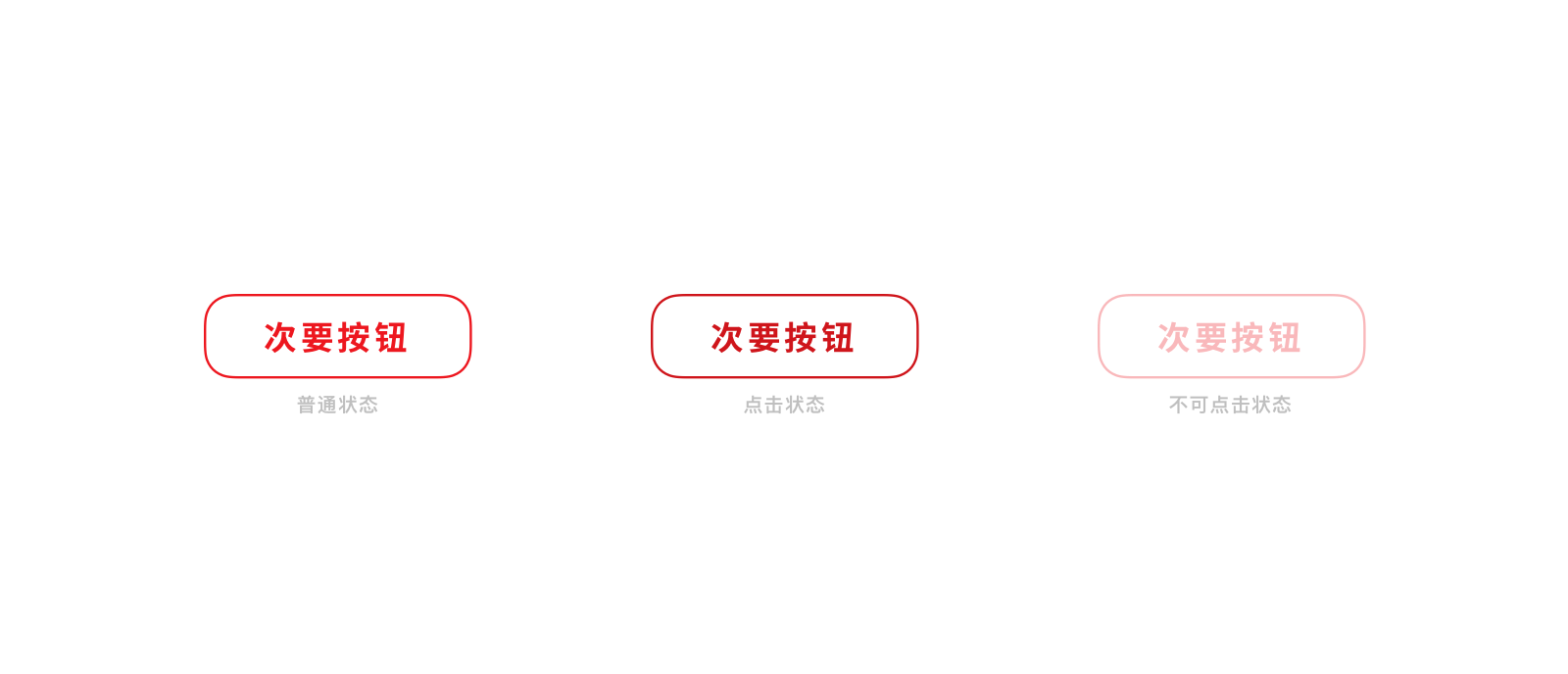
次要按钮
次要按钮是界面中相对次要的用户操作。当出现多于一个按钮的按钮组合时,可以使用多个次要按钮并列来表示优先级类似的不同操作。 次要按钮文字字数规则与主要按钮一致。
<up-button type="secondary">次要按钮</up-button>
<up-button type="secondary" disabled>次要按钮</up-button>
import {Button} from 'up-qp-dls';

<Button title='次要按钮' type='secondary' />
<Button title='次要按钮' type='secondary' disabled />
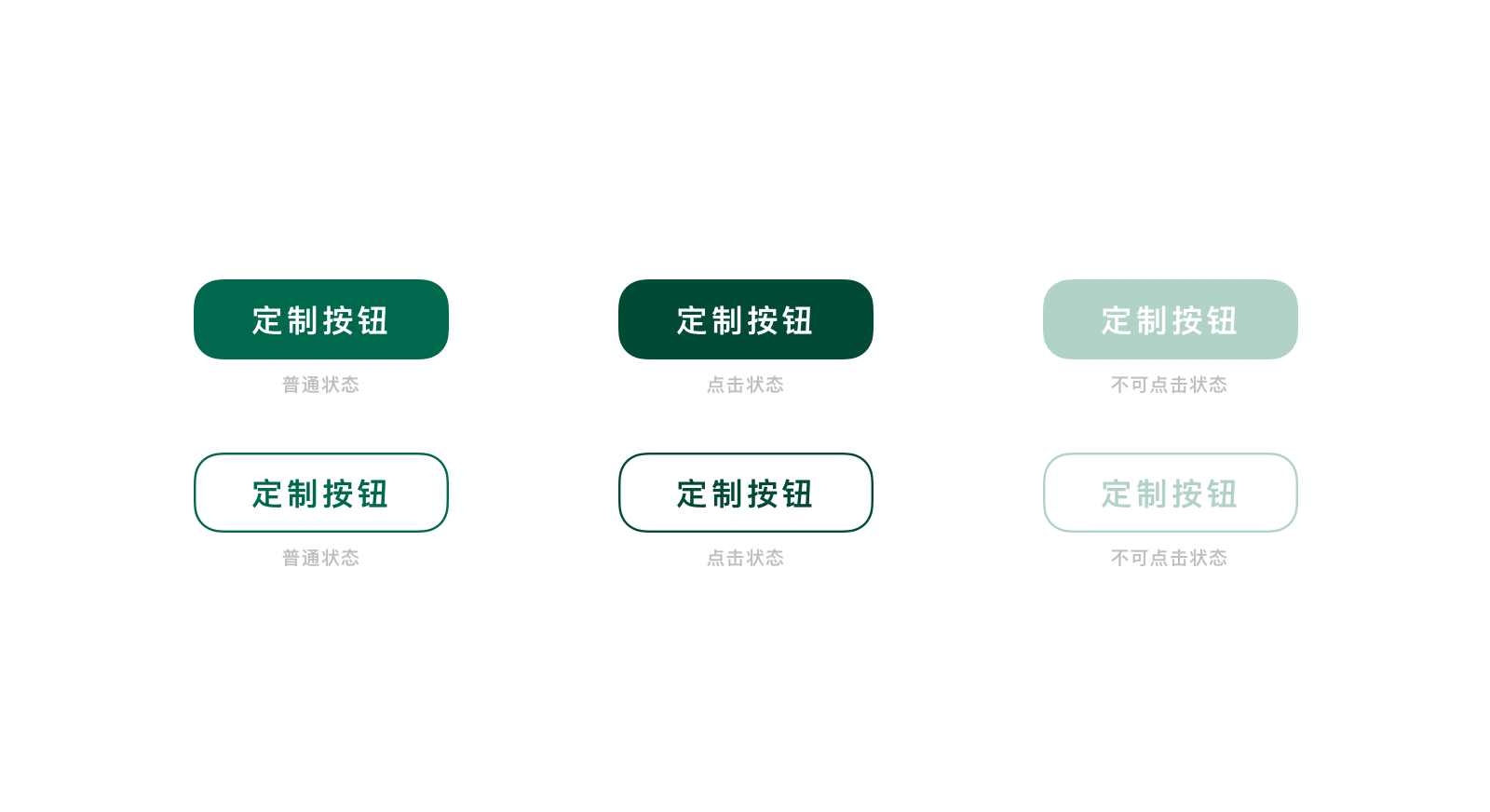
定制按钮
在商户场景中,主要按钮和次要按钮会被代替成使用商户品牌相应颜色的定制按钮。对应颜色规则参考颜色 Color。
注意:定制颜色按钮仅在商户页面出现,请勿在此外的场景出现。
次要按钮文字字数规则与主要按钮一致。
<up-button type="primary" custom-color="#00684d" custom-pressed-color="#004a36">定制按钮</up-button>
<up-button type="primary" custom-color="#00684d" custom-pressed-color="#004a36" disabled>定制按钮</up-button>

<up-button type="secondary" custom-color="#00684d" custom-pressed-color="#004a36">定制按钮</up-button>
<up-button type="secondary" customColor="#00684d" custom-pressed-color="#004a36" disabled>定制按钮</up-button>
<Button title='定制按钮' type='primary' customColor='#00684D' customPressedColor='#004F3A' onPress={() => {}} />
<Button title='定制按钮' type='primary' customColor='#00684D' disabled/>

<Button title='定制按钮' type='secondary' customColor='#00684D' customPressedColor='#004F3A' onPress={() => {}} />
<Button title='定制按钮' type='secondary' customColor='#00684D' disabled/>} />
带图标按钮
按钮需要用图标辅助用户理解时,可使用带图标的按钮样式。图标按钮同样分为主要按钮和次要按钮,使用方式与普通主要按钮和次要按钮一致。 带图标按钮中,至多仅可使用一个图标,且图标需要有想要强调文字的含义一致,不可仅作为装饰。在带图标按钮中,图标和按钮应该一起出现。
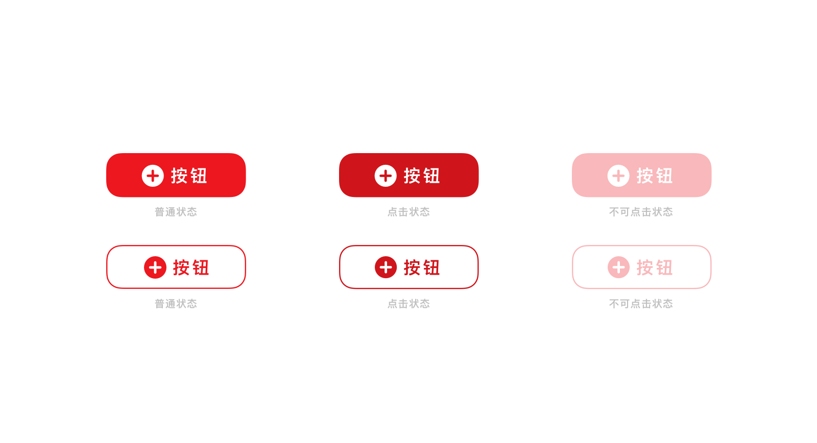
带图标按钮文字应当尽量精简,推荐为 2 到 4 个字。 为避免视觉过度拥挤,主要按钮中最多使用 6 个文字。

<up-button type="primary" icon="up_iconbutton_add">按钮</up-button>
<up-button type="primary" icon="up_iconbutton_add" disabled>按钮</up-button>

<up-button type="secondary" icon="up_iconbutton_add">按钮</up-button>
<up-button type="secondary" icon="up_iconbutton_add" disabled>按钮</up-button>
import {Button} from 'up-qp-dls';

<Button title='按钮' type='primary' icon="button_add" />
<Button title='按钮' type='primary' icon="button_add" disabled/>

<Button title='按钮' type='secondary' icon="button_add" />
<Button title='按钮' type='secondary' icon="button_add" disabled/>
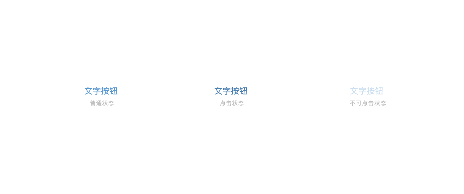
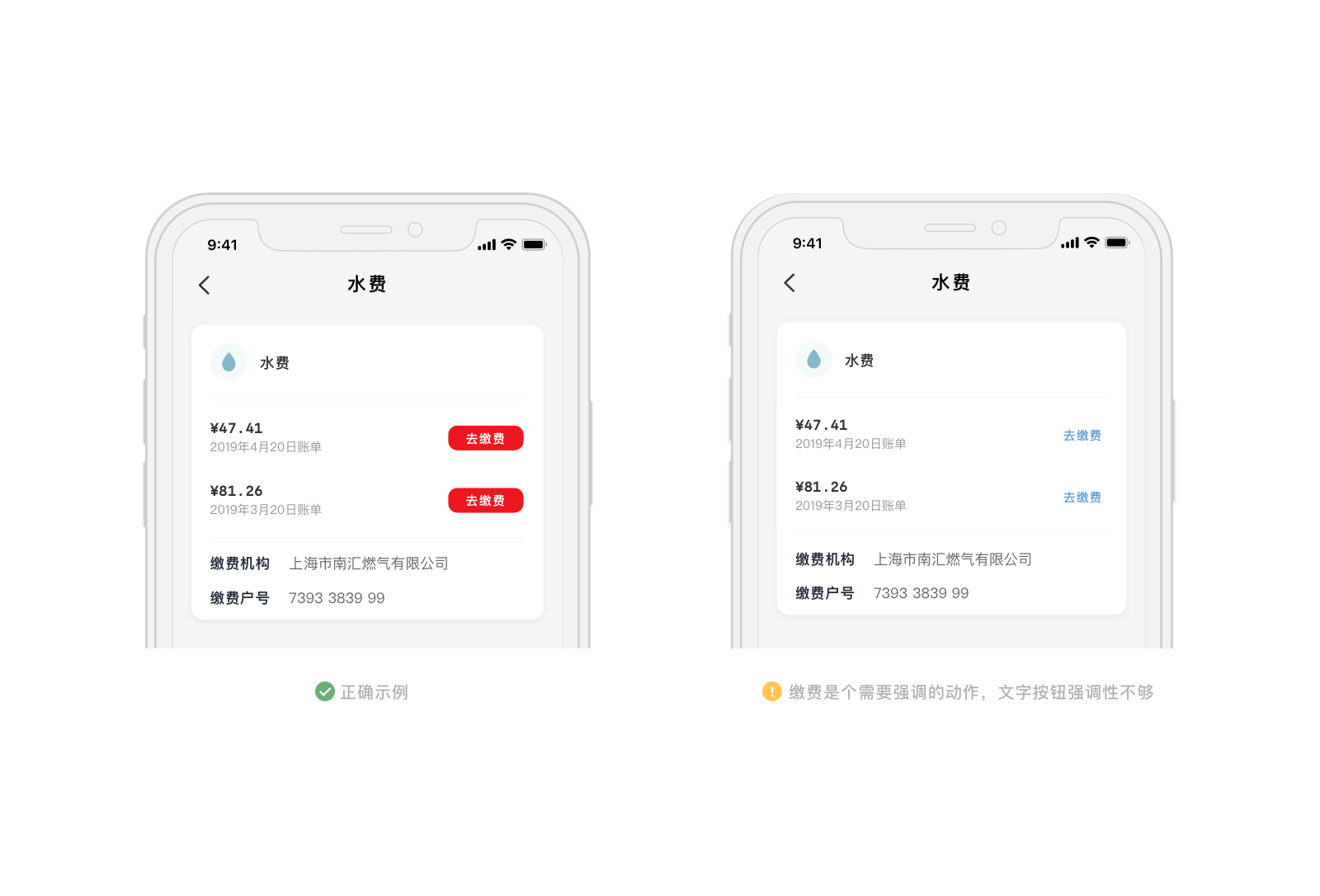
文字按钮
界面中无需特别强调的动作,且周围有更应该突显的内容时,为使按钮与环境融合,可使用文字按钮。 文字按钮推荐为 2 到 4 个字。
文字按钮用蓝色 Blue (#5A98D2) 的纯文字表示可以点击操作的动作,文本必须能够简短清晰地解释相应的动作,如果是文本链接而不是动作,请使用链接按钮。
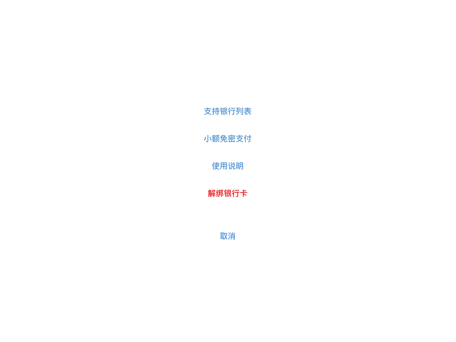
在 Action Sheet (动作表) 中,用主色 Primary (#ED171F) 的文字按钮表示可能带有破坏性的动作(如删除),用于警示用户注意。
<up-button type="text">文字按钮</up-button>
<up-button type="text" disabled>文字按钮</up-button>
import {Button} from 'up-qp-dls';

<Button title='文字按钮' type='text' />
<Button title='文字按钮' type='text' disabled/>
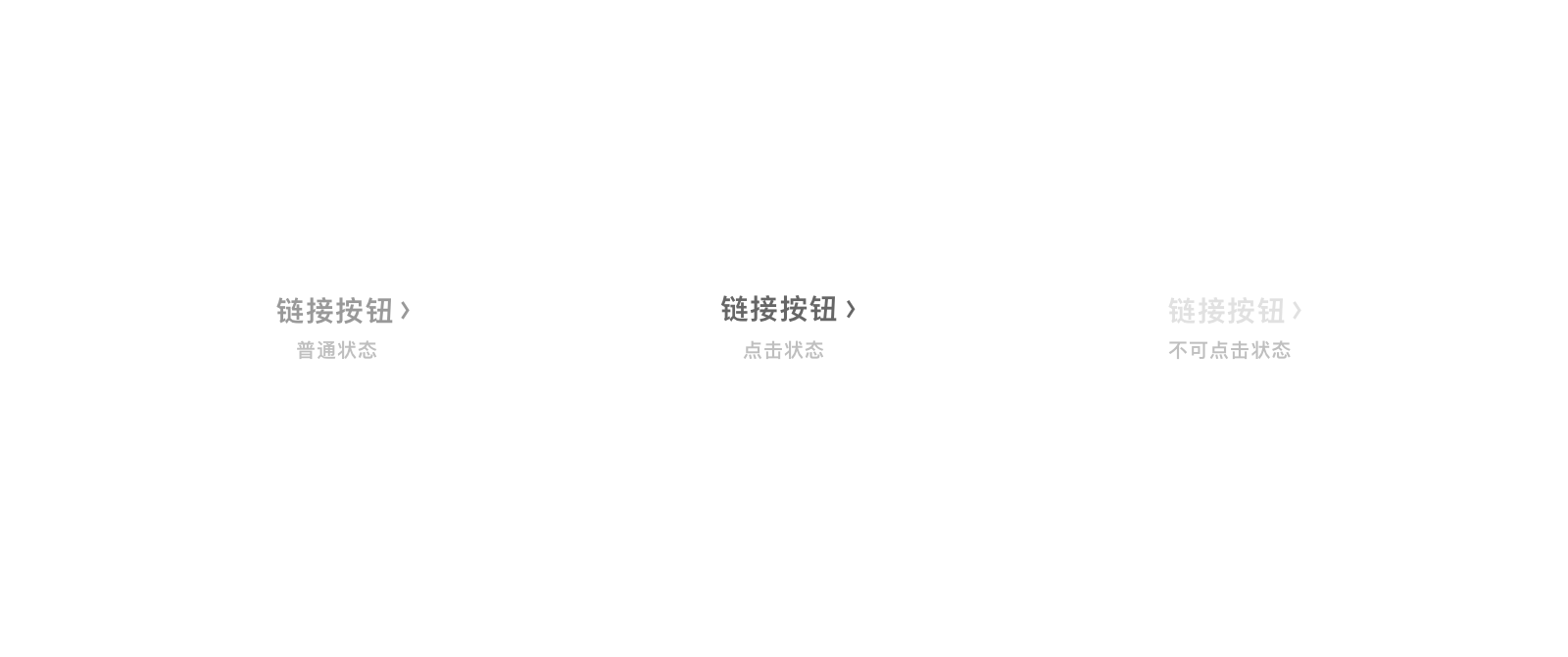
链接按钮
链接按钮用于跳转至另一页的文本链接。
<up-button type="link">链接按钮</up-button>
<up-button type="link" disabled>链接按钮</up-button>
import {Button} from 'up-qp-dls';

<Button title='链接按钮' type='link' />
<Button title='链接按钮' type='link' disabled />
小按钮
需要在列表或者区域狭小位置使用需用户注意的按钮时,可以使用小按钮。 小按钮同样分为主要小按钮和次要小按钮,使用规则与主要按钮和次要按钮一致。小按钮所属组件区域内,仅可最多使用一个主要小按钮。
小按钮字数建议不要超过 4 个字。

<up-button type="link">按钮</up-button>
<up-button type="link" disabled>按钮</up-button>
import {Button} from 'up-qp-dls';

<Button title='链接按钮' type='link' />
<Button title='链接按钮' type='link' disabled />
应用场景
- 一个页面只允许有一个主要按钮出现,且主按钮应该位于右边。
- 按钮文字应该表意清晰,使用简短且含义明确的动词,避免使用 “是” “否” 这样含义模糊的词。
- 不同按钮对于操作的引导强弱不同,应该结合实际需求选择适合强度的按钮。
Vue.js Reference
| 属性 | 说明 | 类型 | 可选值 | 默认值 |
|---|---|---|---|---|
| type | 按钮类型 | String | primary,secondary,text,link |
primary |
| icon | icon font 中的图标名称 | String | - | - |
| size | 按钮大小 | String | md,sm |
md |
| custom-color | 自定义按钮颜色,只有当 type 为 primary 或 secondary 时才会起作用,根据 type 自动加载到对应的文字、背景和边框上 | String | Hex 值、rgb 函数、rgba 函数、hsl 函数、hsla 函数 | - |
| custom-pressed-color | 自定义按钮按下颜色 | String | Hex 值、rgb 函数、rgba 函数、hsl 函数、hsla 函数 | - |
| disabled | 是否禁用 | Boolean | - | false |
React Native Reference
通过扩展 TouchableHighlight 来实现。
| 属性 | 说明 | 类型 | 可选值 | 默认值 |
|---|---|---|---|---|
| title | 按钮的文字 | String | - | 无 |
| type | 按钮类型 | String | primary secondary text link |
primary |
| icon | icon font 中的图标名称 | String | - | - |
| customColor | 自定义按钮颜色,只有当 type 为 primary 或 secondary 时才会起作用,根据 type 自动加载到对应的文字、背景和边框上 |
string | Hex 值、rgb 函数、rgba 函数、hsl 函数、hsla 函数 | - |
| customPressedColor | 自定义按钮按下颜色 | String | Hex 值、rgb 函数、rgba 函数、hsl 函数、hsla 函数 | - |
| disabled | 是否禁用 | Boolean | - | false |