界面组件 UI Components
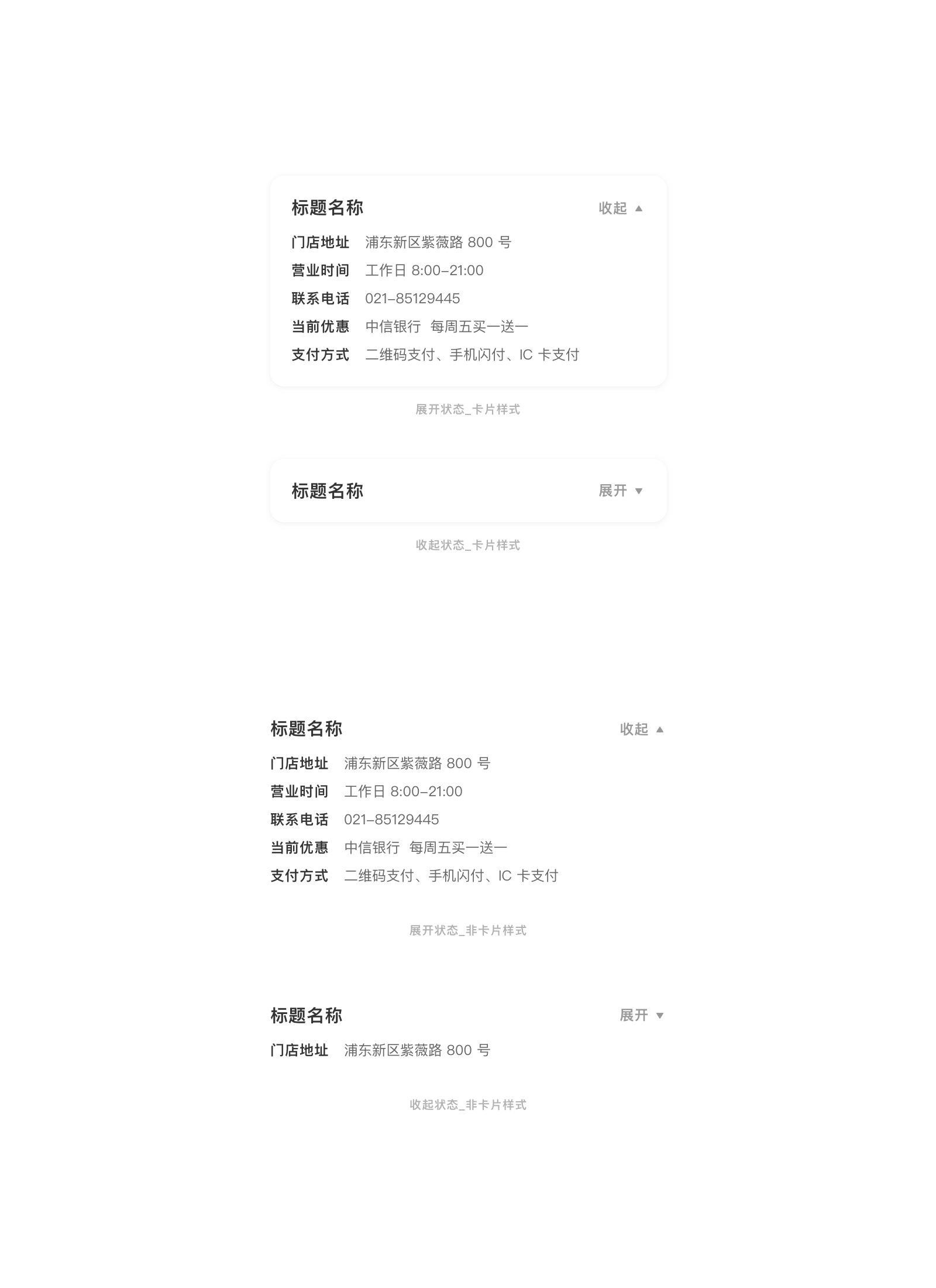
折叠 Collapse
可以同时折叠/展开的内容区域,对复杂的细节信息进行分组和隐藏,保持页面的整洁高效。 与手风琴不同的是,多个折叠可以同时展开。
适用情况
- 内容较多,不需要将信息完全展示在页面的部分,且该项之后还有需要展示的内容。
不适用情况
- 内容里有影响用户下一步操作的重要信息。
- 内容篇幅过长,超出一整屏时,应考虑精简信息或者将多余信息放入下一层级。
- 当有多个折叠堆叠,每个折叠信息较多且用户没有对比不同折叠信息的需求。建议使用手风琴。
折叠
用于放置多个子项,使用时可根据业务需求决定收起状态时显示多少个子项。
<up-collapse v-model="open1" type="card" label-collapsed="展开" label-expended="收起" @onChange="onChange">
	<div class="docs-collapse-card-cot">
		<div class="has-text-section-title cot-title">标题名称</div>
	</div>
	<div slot="collapse-slot">
		<div class="docs-collapse-card-desc">
			<div class="docs-collapse-card-desc-item">
				<div class="has-text-subtitle desc-title">门店地址</div>
				<div class="has-text-small desc-text">浦东新区紫薇路 800 号</div>
			</div>
			<div class="docs-collapse-card-desc-item">
				<div class="has-text-subtitle desc-title">营业时间</div>
				<div class="has-text-small desc-text">工作日 8:00-21:00</div>
			</div>
			<div class="docs-collapse-card-desc-item">
				<div class="has-text-subtitle desc-title">联系电话</div>
				<div class="has-text-small desc-text">021-85129445</div>
			</div>
			<div class="docs-collapse-card-desc-item">
				<div class="has-text-subtitle desc-title">当前优惠</div>
				<div class="has-text-small desc-text">中信银行 每周五买一送一</div>
			</div>
			<div class="docs-collapse-card-desc-item">
				<div class="has-text-subtitle desc-title">支付方式</div>
				<div class="has-text-small desc-text">二维码支付、手机闪付、IC 卡支付</div>
			</div>
		</div>
	</div>
</up-collapse>

<up-collapse v-model="open2" type="plain" label-collapsed="展开" label-expended="收起">
	<div class="docs-collapse-card-cot">
		<div class="has-text-section-title cot-title">标题名称</div>
		<div class="docs-collapse-card-desc-item">
			<div class="has-text-subtitle desc-title">门店地址</div>
			<div class="has-text-small desc-text">浦东新区紫薇路 800 号</div>
		</div>
	</div>
	<div slot="collapse-slot">
		<div class="docs-collapse-card-desc">
			<div class="docs-collapse-card-desc-item">
				<div class="has-text-subtitle desc-title">营业时间</div>
				<div class="has-text-small desc-text">工作日 8:00-21:00</div>
			</div>
			<div class="docs-collapse-card-desc-item">
				<div class="has-text-subtitle desc-title">联系电话</div>
				<div class="has-text-small desc-text">021-85129445</div>
			</div>
			<div class="docs-collapse-card-desc-item">
				<div class="has-text-subtitle desc-title">当前优惠</div>
				<div class="has-text-small desc-text">中信银行 每周五买一送一</div>
			</div>
			<div class="docs-collapse-card-desc-item">
				<div class="has-text-subtitle desc-title">支付方式</div>
				<div class="has-text-small desc-text">二维码支付、手机闪付、IC 卡支付</div>
			</div>
		</div>
	</div>
</up-collapse>

<script>

export default {
  data () {
    return {
      open1:true,
      open2:true,
    }
  },
  methods:{
    onChange(ev){
      //console.log(ev)
    }
  }
}
</script>
		<ScrollView style={{flex:1}}>
			<View style={{height:Theme.spaceM}}></View>
			<CollapsableBox type='plain' visible={
				<View>
					<Label style={{paddingVertical:Theme.spaceXS}} type='sectionTitle' text='标题名称'/>
					<View style={{flexDirection:'row', paddingVertical:Theme.spaceXS}}>
						<Label type='smallTitle' text='门店地址' style={{marginRight:Theme.spaceM}}/>
						<Label type='smallText' text='浦东新区紫薇路 800 号'/>
					</View>
				</View>
				} collapsable={
				<View>
					<View style={{flexDirection:'row', paddingVertical:Theme.spaceXS}}>
						<Label type='smallTitle' text='营业时间' style={{marginRight:Theme.spaceM}}/>
						<Label type='smallText' text='工作日 8:00-21:00'/>
					</View>
					<View style={{flexDirection:'row', paddingVertical:Theme.spaceXS}}>
						<Label type='smallTitle' text='联系电话' style={{marginRight:Theme.spaceM}}/>
						<Label type='smallText' text='021-85129445'/>
					</View>
					<View style={{flexDirection:'row', paddingVertical:Theme.spaceXS}}>
						<Label type='smallTitle' text='当前优惠' style={{marginRight:Theme.spaceM}}/>
						<Label type='smallText' text='中信银行  每周五买一送一'/>
					</View>
					<View style={{flexDirection:'row', paddingVertical:Theme.spaceXS}}>
						<Label type='smallTitle' text='支付方式' style={{marginRight:Theme.spaceM}}/>
						<Label type='smallText' text='二维码支付、手机闪付、IC 卡支付'/>
					</View>
				</View>
			} />

			<View style={{height:Theme.spaceM}}></View>

			<View style={{paddingHorizontal:Theme.spaceM}}>
			<CollapsableBox type='card' visible={
				<View>
					<Label style={{paddingVertical:Theme.spaceXS}} type='sectionTitle' text='标题名称'/>
					<View style={{flexDirection:'row', paddingVertical:Theme.spaceXS}}>
						<Label type='smallTitle' text='门店地址' style={{marginRight:Theme.spaceM}}/>
						<Label type='smallText' text='浦东新区紫薇路 800 号'/>
					</View>
				</View>
			} collapsable={
				<View>
					<View style={{flexDirection:'row', paddingVertical:Theme.spaceXS}}>
						<Label type='smallTitle' text='营业时间' style={{marginRight:Theme.spaceM}}/>
						<Label type='smallText' text='工作日 8:00-21:00'/>
					</View>
					<View style={{flexDirection:'row', paddingVertical:Theme.spaceXS}}>
						<Label type='smallTitle' text='联系电话' style={{marginRight:Theme.spaceM}}/>
						<Label type='smallText' text='021-85129445'/>
					</View>
					<View style={{flexDirection:'row', paddingVertical:Theme.spaceXS}}>
						<Label type='smallTitle' text='当前优惠' style={{marginRight:Theme.spaceM}}/>
						<Label type='smallText' text='中信银行  每周五买一送一'/>
					</View>
					<View style={{flexDirection:'row', paddingVertical:Theme.spaceXS}}>
						<Label type='smallTitle' text='支付方式' style={{marginRight:Theme.spaceM}}/>
						<Label type='smallText' text='二维码支付、手机闪付、IC 卡支付'/>
					</View>
				</View>
			} />
			</View>

			<View style={{height: Theme.screenInset.bottom}} />
		</ScrollView>
文字折叠
用于放置大段文本,用户可以根据自己需求点击展开阅读或收起文本。

<up-collapse :collapsed-height="220" v-model="open3" type="text" label-collapsed="展示" label-expended="收起">
	<div class="docs-collapse-text-cot">
		<div class="has-text-section-title cot-title">使用规则</div>
		<div class="has-text-small cot-desc">本券需先获取,限卡号 62 开头的中信卡可领取优惠券。领取后在指定门店显示优惠券,即可享手调咖啡买一赠一。每人每活动日限享 1 次本活动优惠。
		本次活动对象为中国境内发行的银联信用卡(卡号以 62 开头)持卡人。每活动日限前 1500 只,单卡单日限购 1 杯。仅支持信用卡刷卡、插卡、挥卡支付方式<br><br>本券需先获取,限卡号 62 开头的中信卡可领取优惠券。领取后在指定门店显示优惠券,即可享手调咖啡买一赠一。每人每活动日限享 1 次本活动优惠。<br><br>
		本次活动对象为中国境内发行的银联信用卡(卡号以 62 开头)持卡人。每活动日限前 1500 只,单卡单日限购 1 杯。仅支持信用卡刷卡、插卡、挥卡支付方式<br><br>本券需先获取,限卡号 62 开头的中信卡可领取优惠券。领取后在指定门店显示优惠券,即可享手调咖啡买一赠一。每人每活动日限享 1 次本活动优惠。<br><br>
		本次活动对象为中国境内发行的银联信用卡(卡号以 62 开头)持卡人。每活动日限前 1500 只,单卡单日限购 1 杯。仅支持信用卡刷卡、插卡、挥卡支付方式</div>
	</div>
</up-collapse>

<script>
export default {
  data () {
    return {
      open3:false,
    }
  },
}
</script>
<CollapsableBoxText collapsedHeight={200}>
				<Label type='title' text='使用规则' style={{marginBottom: Theme.spaceS}}/>
				<Label type='smallText' numberOfLines={16} text='本券需先获取,限卡号 62 开头的中信卡可领取优惠券。领取后在指定门店显示优惠券,即可享手调咖啡买一赠一。每人每活动日限享 1 次本活动优惠。本次活动对象为中国境内发行的银联信用卡(卡号以 62 开头)持卡人。每活动日限前 1500 只,单卡单日限购 1 杯。仅支持信用卡刷卡、插卡、挥卡支付方式。本券需先获取,限卡号 62 开头的中信卡可领取优惠券。领取后在指定门店显示优惠券,即可享手调咖啡买一赠一。每人每活动日限享 1 次本活动优惠。本次活动对象为中国境内发行的银联信用卡(卡号以 62 开头)持卡人。每活动日限前 1500 只,单卡单日限购 1 杯。仅支持信用卡刷卡、插卡、挥卡支付方式。' style={{color: Theme.grayColor1, lineHeight: Theme.spaceM}} />
</CollapsableBoxText>
Vue.js Reference
| 属性 | 说明 | 类型 | 可选值 | 默认值 |
|---|---|---|---|---|
| v-model | 控制展开收起状态 | Boolean | - | false |
| type | 折叠类型 | String | text 设定高度的折叠框类型, plain 为边到边的折叠框类型, card 为卡片折叠框类型 |
plain |
| label-collapsed | 收起时的按钮文字 | String | - | 展开 |
| label-expended | 展开时的按钮文字 | String | - | 收起 |
| collapsed-height | text类型时,需要配置的折叠高度 |
Number | - | 150 |
- 插槽
| 名字 | 说明 | 参数 |
|---|---|---|
| 默认插槽 | text类型时由高度控制,会被折叠, card和plain类型时,默认插槽不会被折叠 |
- |
| collapse-slot | card和plain类型,插入可折叠型内容 |
- |
| 事件 | 说明 | 参数 |
|---|---|---|
| onChange | 折叠状态改变时触发 | 折叠状态 status:Boolean |
React Native Reference
在 RN 中使用两个对象来分别实现文字折叠和控件折叠。
- CollapsableBox - 折叠 - 通过设定可被折叠的控件实现
- CollapsableBoxText - 文字折叠 - 通过设定折叠起后的高度来实现
CollapsableBox
| 属性 | 说明 | 类型 | 可选值 | 默认值 |
|---|---|---|---|---|
| type | 折叠框的外框类型 | enum | plain 为边到边的折叠框类型, card 为卡片折叠框类型 |
plain |
| visible | 折叠后仍然可见的组件 | PropTypes.element | - | |
| collapsable | 可以被折叠收起,折叠后被隐藏的组件 | PropTypes.element | - | |
| labelCollapsed | 折叠后的按钮文字 | string | - | ‘展开’ |
| labelExpended | 展开后的按钮文字 | string | - | ‘收起’ |
| 事件 | 说明 | 参数 |
|---|---|---|
| onChange | 折叠状态改变时触发 | 折叠状态 status:Boolean 是否展开,为 true 时表示当前为展开状态 |
CollapsableBoxText
| 属性 | 说明 | 类型 | 可选值 | 默认值 |
|---|---|---|---|---|
| collapsedHeight | 折叠后的高度 | number | - | 150 |
| labelCollapsed | 折叠后的按钮文字 | string | - | ‘展开’ |
| labelExpended | 展开后的按钮文字 | string | - | ‘收起’ |
| 事件 | 说明 | 参数 |
|---|---|---|
| onChange | 折叠状态改变时触发 | 折叠状态 status:Boolean 是否展开,为 true 时表示当前为展开状态 |