界面组件 UI Components
列表 List
列表用于展示一列垂直对齐的内容,通常由文字和图像元素组成。 列表有单行文字列表和双行文字列表,两者都可使用图标等视觉元素。单行文字列表和双行文字列表可单独使用,也可组合使用。
单行文字列表
单行文字列表中文字字段可置于列表左侧或右侧,文字字段可搭配图片或图标使用。
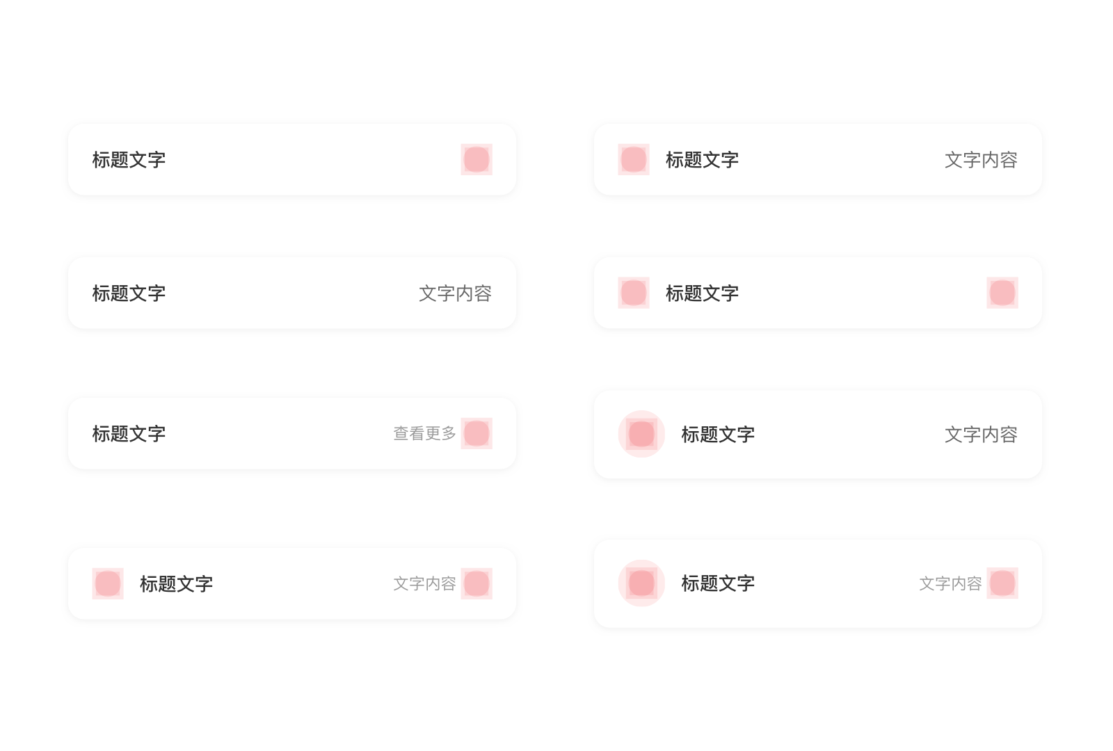
<up-list left-title="标题文字"></up-list>

<up-list left-title="标题文字"  right-title="文字内容"></up-list>

<up-list icon-left-name="up_iconfunc_search" icon-left-color-class="has-text-gray2"  left-title="标题文字"></up-list>

<up-list icon-left-name="up_iconfunc_search" icon-left-color-class="has-text-gray2"  left-title="标题文字"  right-title="文字内容"></up-list>

<up-list size="lg" icon-left-name="up_iconfunc_search" icon-left-color-class="has-text-gray2"  left-title="标题文字"  right-title="文字内容"></up-list>

<up-list icon-right-name="up_iconfunc_right_arrow" icon-right-color-class="has-text-gray2" left-title="标题文字"></up-list>

<up-list icon-right-name="up_iconfunc_right_arrow" icon-right-color-class="has-text-gray2" left-title="标题文字" right-title="文字内容"></up-list>

<up-list icon-left-name="up_iconfunc_search" icon-left-color-class="has-text-gray2" icon-right-name="up_iconfunc_right_arrow" icon-right-color-class="has-text-gray2" left-title="标题文字" right-title="文字内容"></up-list>

<up-list icon-left-name="up_iconfunc_search" icon-left-color-class="has-text-gray2" icon-right-name="up_iconfunc_right_arrow" icon-right-color-class="has-text-gray2" left-title="标题文字"></up-list>

<up-list size="lg" icon-left-name="up_iconfunc_search" icon-left-color-class="has-text-gray2" icon-right-name="up_iconfunc_right_arrow" icon-right-color-class="has-text-gray2" left-title="标题文字"></up-list>
<ListSection>
	<ListRow title='标题文字' />
</ListSection>
<ListSection>
	<ListRow title='标题文字' detail='文字内容' />
</ListSection>
<ListSection >
	<ListRow title='标题文字' icon={<Icon name='sys_notification' color={Theme.secondaryColorYellow}/>}/>
</ListSection>
<ListSection >
	<ListRow title='标题文字' icon={<Icon name='sys_notification' color={Theme.secondaryColorYellow}/>} detail='文字内容' />
</ListSection>

<ListSection>
	<ListRow title='标题文字' accessory='indicator'/>
</ListSection>
<ListSection>
	<ListRow title='标题文字' detailSubText='查看更多' accessory='indicator'/>
</ListSection>
<ListSection >
	<ListRow title='标题文字' icon={<Icon name='sys_notification' color={Theme.secondaryColorYellow}/>} accessory='indicator'/>
</ListSection>
<ListSection >
	<ListRow title='标题文字' icon={<Icon name='sys_notification' color={Theme.secondaryColorYellow}/>} detail='文字内容'  accessory='indicator'/>
</ListSection>
双行文字列表
双行文字列表与单行文字列表的区别在于文字字段含有一级文本和二级文本。 右侧图标有 24×24(带 36×36 圆形容器)和 24×24(无圆形容器)两种,通常应使用 24×24(带 36×36 圆形容器)的样式。如列表中图标重要性不高,可以使用 24×24(无圆形容器)的样式。
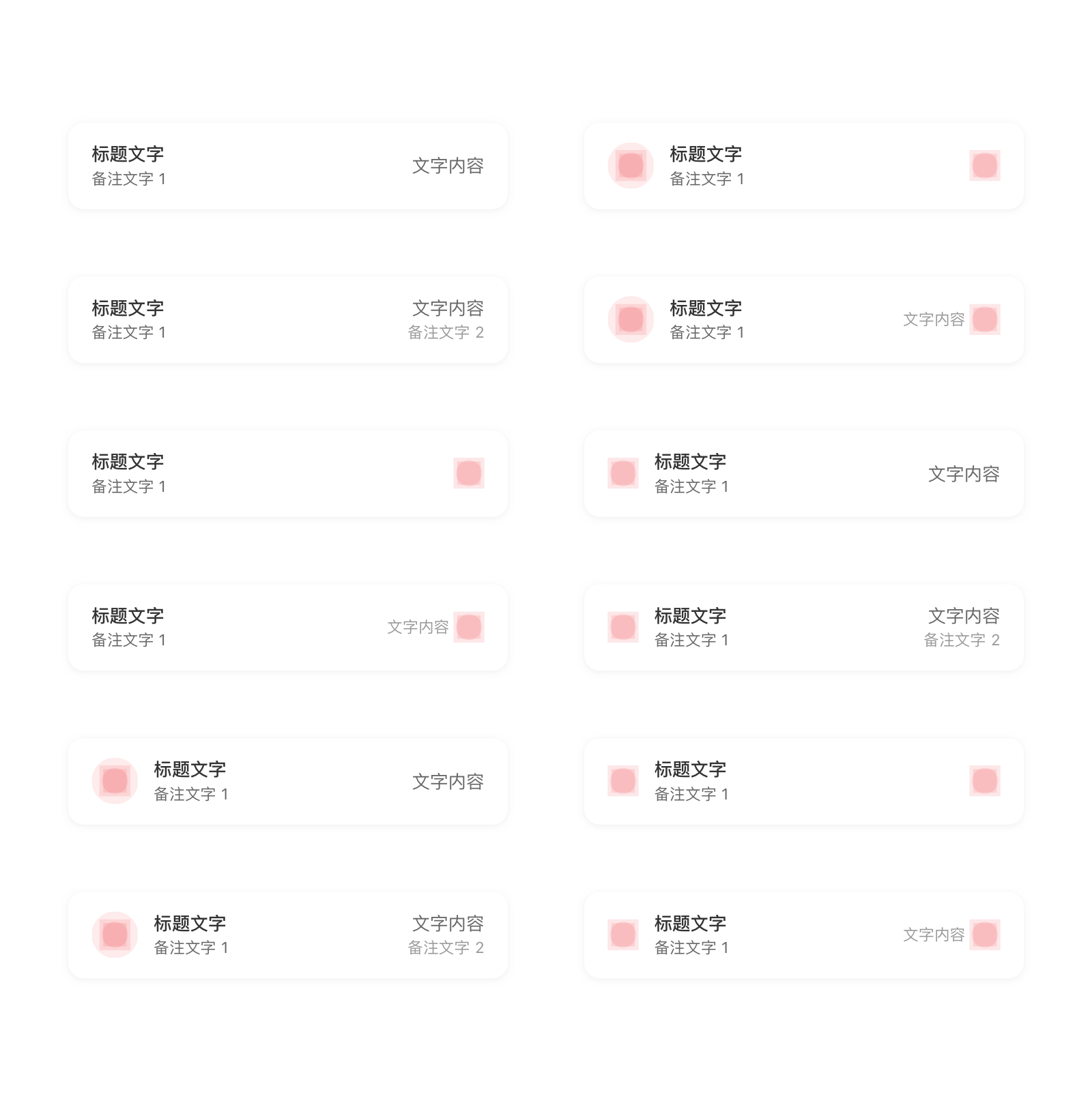
<up-list size="lg" left-title="标题文字" left-desc="备注文字1"></up-list>

<up-list size="lg" icon-left-name="up_iconfunc_search" icon-left-color-class="has-text-gray2" left-title="标题文字" left-desc="备注文字1"></up-list>

<up-list size="lg" icon-left-name="up_iconfunc_search" icon-left-color-class="has-text-gray2" left-title="标题文字" left-desc="备注文字1" right-title="文字内容"></up-list>

<up-list size="lg" icon-left-name="up_iconfunc_search" icon-left-color-class="has-text-gray2" left-title="标题文字" left-desc="备注文字1" right-title="文字内容" right-desc="备注文字2"></up-list>
<up-list size="lg" icon-right-name="up_iconfunc_right_arrow" icon-right-color-class="has-text-gray2" left-title="标题文字" left-desc="备注文字1"></up-list>

<up-list size="lg" icon-left-name="up_iconfunc_search" icon-left-color-class="has-text-gray2" icon-right-name="up_iconfunc_right_arrow" icon-right-color-class="has-text-gray2" left-title="标题文字" left-desc="备注文字1"></up-list>

<up-list size="lg" icon-right-name="up_iconfunc_right_arrow" icon-right-color-class="has-text-gray2" left-title="标题文字" left-desc="备注文字1" right-title="文字内容"></up-list>

<up-list size="lg" icon-left-name="up_iconfunc_search" icon-left-color-class="has-text-gray2" icon-right-name="up_iconfunc_right_arrow" icon-right-color-class="has-text-gray2" left-title="标题文字" left-desc="备注文字1" right-title="文字内容"></up-list>
<ListSection>
	<ListRow title='标题文字' subTitle='备注文字 1' />
</ListSection>
<ListSection>
	<ListRow title='标题文字' subTitle='备注文字 1' icon={<Icon name='sys_notification' color={Theme.secondaryColorYellow}/>} />
</ListSection>
<ListSection>
	<ListRow title='标题文字' subTitle='备注文字 1' icon={<Icon name='sys_notification' color={Theme.secondaryColorYellow}/> detail='文字内容' />
</ListSection>
<ListSection>
	<ListRow title='标题文字' subTitle='备注文字 1' icon={<Icon name='sys_notification' color={Theme.secondaryColorYellow}/> detail='文字内容'  detailSubText='备注文字'/>
</ListSection>

<ListSection>
	<ListRow title='标题文字' subTitle='备注文字 1' accessory='indicator' />
</ListSection>
<ListSection>
	<ListRow title='标题文字' subTitle='备注文字 1' icon={<Icon name='sys_notification' color={Theme.secondaryColorYellow}/> accessory='indicator' />
</ListSection>
<ListSection>
	<ListRow title='标题文字' subTitle='备注文字 1' icon={<Icon name='sys_notification' color={Theme.secondaryColorYellow}/> detailSubText='文字内容'  accessory='indicator' />
</ListSection>
<ListSection>
	<ListRow title='标题文字' subTitle='备注文字 1' icon={<Icon name='sys_notification' color={Theme.secondaryColorYellow}/> detailSubText='文字内容' accessory='indicator' />
</ListSection>
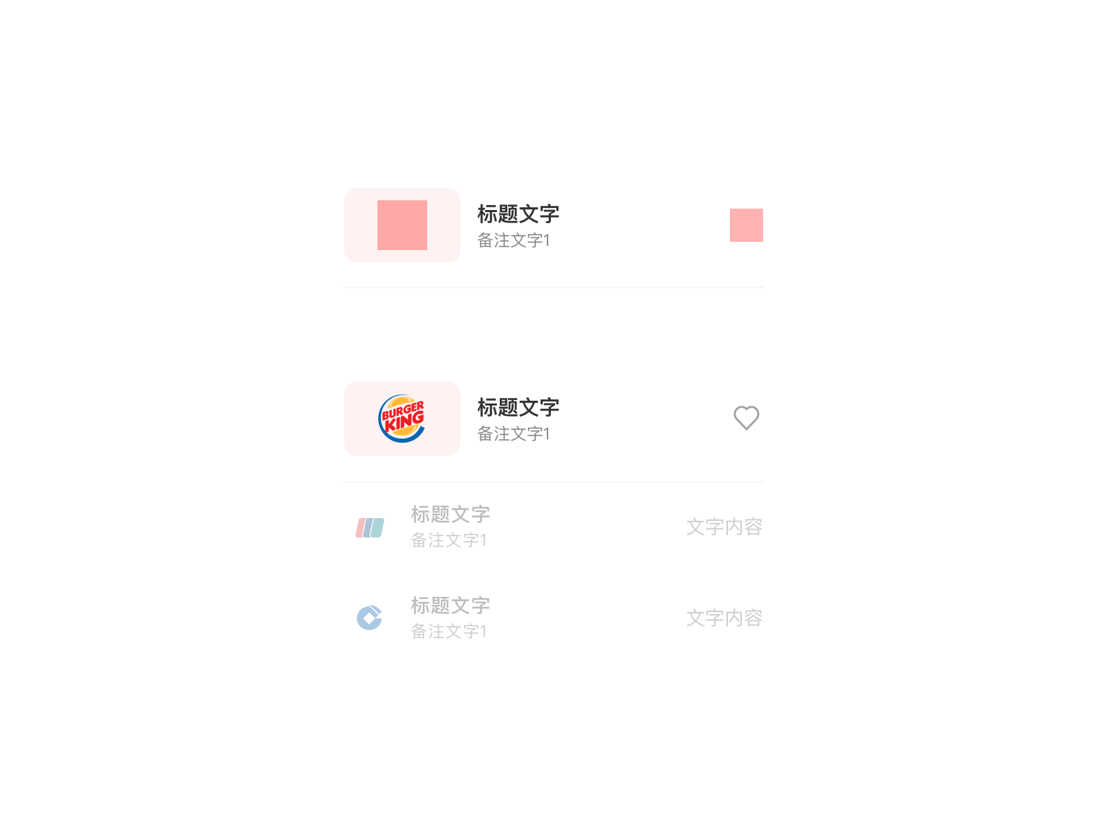
列表表头
列表表头将同一类信息汇总并以视觉突出的形式呈现出来,让用户能够快速看到信息并与之互动。以享优惠频道的品牌优惠列表为例,表头由图片、文字字段和图标按钮组成。图片为用户提供视觉线索,让用户快速找到品牌优惠。文字字段包含两行文字,用户通过点击字段右侧图标进一步查看或获取品牌优惠。
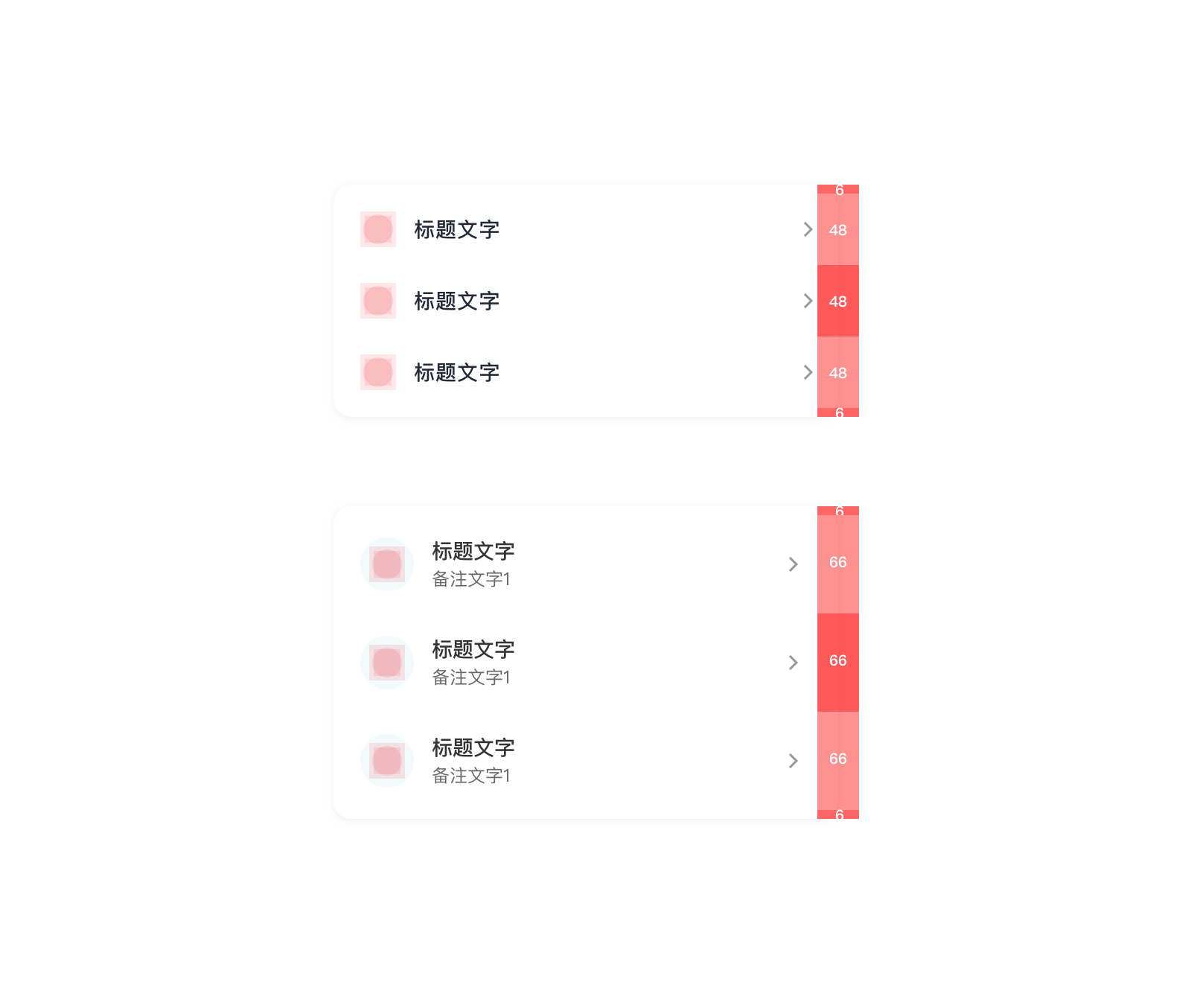
列表堆叠状态
为使列表更简洁,信息阅读更流畅,列表堆叠时采用无分割线的设计。 由于无分割线,且卡片圆角较大,如果直接将卡片堆叠在一起,会出现列表内容之间距视觉上过开,内容距离卡片边缘过挤的感觉。 为了视觉上的协调,在列表堆叠时设计和开发时,需针对堆叠列表进行视觉补偿,即稍微缩小列表的高度,并且在列表边缘添加 6pt 的距离。
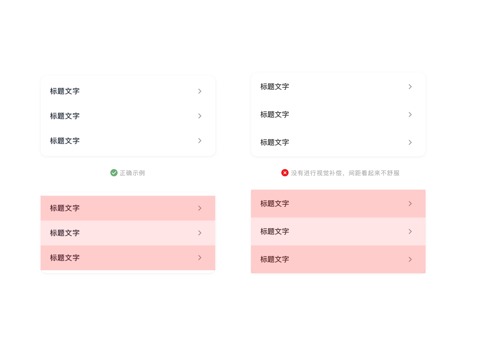
如图所示分别为单行列表堆叠和双行列表堆叠时的视觉补偿。
<up-list-group>
  <up-list icon-left-name="up_iconsys_id" icon-left-color-class="has-text-secondaryCyan" icon-right-name="up_iconfunc_right_arrow" icon-right-color-class="has-text-gray2" left-title="标题文字"></up-list>
  <up-list icon-left-name="up_iconsys_payment_setting" icon-left-color-class="has-text-secondaryBlue" icon-right-name="up_iconfunc_right_arrow" icon-right-color-class="has-text-gray2" left-title="标题文字"></up-list>
  <up-list icon-left-name="up_iconsys_security_settings" icon-left-color-class="has-text-secondaryCyan" icon-right-name="up_iconfunc_right_arrow" icon-right-color-class="has-text-gray2" left-title="标题文字"></up-list>
</up-list-group>

<up-list-group>
  <up-list size="lg" icon-left-name="up_iconsys_id" icon-left-color-class="has-text-secondaryCyan" icon-right-name="up_iconfunc_right_arrow" icon-right-color-class="has-text-gray2" left-title="标题文字"></up-list>
  <up-list size="lg" icon-left-name="up_iconsys_payment_setting" icon-left-color-class="has-text-secondaryBlue" icon-right-name="up_iconfunc_right_arrow" icon-right-color-class="has-text-gray2" left-title="标题文字"></up-list>
  <up-list size="lg" icon-left-name="up_iconsys_security_settings" icon-left-color-class="has-text-secondaryCyan" icon-right-name="up_iconfunc_right_arrow" icon-right-color-class="has-text-gray2" left-title="标题文字"></up-list>
</up-list-group>
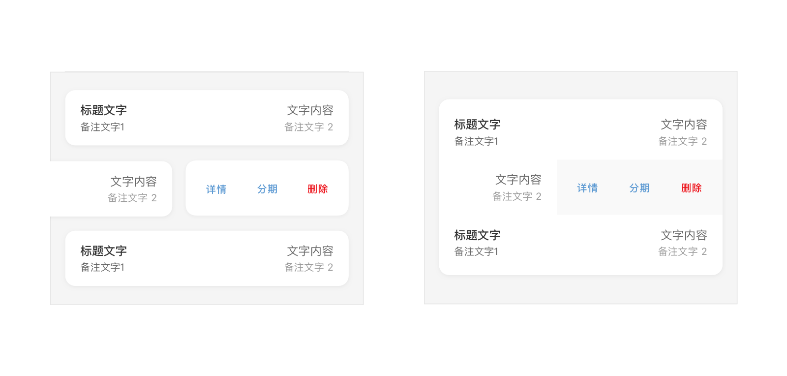
列表编辑
在某些使用场景下,列表允许用户从右往左滑动呼出列表编辑功能。
<up-group type="merge-list-tools" tool-type="card">
	<up-list size="lg" type="tool" :tools="[{'title':'详情','alert': true},{'title':'分期'}]"  @onClickTool="onClickTool" left-title="10月账单" left-desc="出账日 10-25" right-title="<span class='has-text-fin'>¥790.00</span>"  right-desc="未出账"></up-list>
	<up-list size="lg" type="tool" :tools="[{'title':'详情'},{'title':'分期'},{'title':'删除','alert': true}]"  @onClickTool="onClickTool" left-title="9月账单" left-desc="出账日 10-25" right-title="<span class='has-text-fin'>¥1,537.00</span>"  right-desc="<span class='has-text-primary'>未付金额<span class='has-text-fin'>¥537.00</span></span>"></up-list>
	<up-list size="lg" type="tool" :tools="[{'title':'详情'}]"  @onClickTool="onClickTool" left-title="8月账单" left-desc="出账日 10-25" right-title="<span class='has-text-fin'>¥1,700.00</span>"  right-desc="已还清"></up-list>
</up-group>

<up-group type="merge-list-tools" tool-type="plain">
	<up-list type="tool" :tools="[{'title':'详情'}]"  @onClickTool="onClickTool" left-title="10月账单" left-desc="出账日 10-25" right-title="<span class='has-text-fin'>¥790.00</span>"  right-desc="未出账"></up-list>
	<up-list type="tool" :tools="[{'title':'详情','alert': true},{'title':'分期'}]"  @onClickTool="onClickTool" left-title="9月账单" left-desc="出账日 10-25" right-title="<span class='has-text-fin'>¥1,537.00</span>"  right-desc="<span class='has-text-primary'>未付金额<span class='has-text-fin'>¥537.00</span></span>"></up-list>
	<up-list type="tool" :tools="[{'title':'详情'},{'title':'分期'},{'title':'删除','alert': true}]"  @onClickTool="onClickTool" left-title="8月账单" left-desc="出账日 10-25" right-title="<span class='has-text-fin'>¥1,700.00</span>"  right-desc="已还清"></up-list>
</up-group>

<script>
export default {
  methods:{
    onClickTool(idx){}
  }
}
</script>
应用场景
- 多条列表展示内容时,应善于使用卡片的形式将不同类别的内容归类。
Vue.js Reference
| 属性 | 说明 | 类型 | 可选值 | 默认值 |
|---|---|---|---|---|
| size | 列表大小 | String | md,lg |
md |
| type | 列表类型 | String | default 默认类型,tool 带有工具菜单的类型 |
default |
| tools | 左滑出现的工具菜单配置,例如:[{'title':'详情',alert:true}] |
Array | - | - |
| left-title | 左侧标题 | String | - | - |
| left-desc | 左侧描述 | String | - | - |
| right-title | 右侧标题 | String | - | - |
| right-desc | 右侧描述 | String | - | - |
| icon-left-name | 左侧图标名称 | String | - | - |
| icon-left-color-class | 左侧图标颜色类 | String | 已定义的色盘颜色text class值 |
- |
| icon-right-name | 右侧图标名称 | String | - | - |
| icon-right-color-class | 右侧图标颜色类 | String | 已定义的色盘颜色text class值 |
- |
- tools 子配置项
| 属性 | 说明 | 类型 | 可选值 | 默认值 |
|---|---|---|---|---|
| title | 工具菜单选项标题 | String | - | - |
| alert | 菜单项为主色 | Boolean | - | - |
| 事件 | 说明 | 参数 |
|---|---|---|
| onPress | 单击列表选项 | - |
| onClickTool | 单击工具菜单选项 | index: Number |
* 将 <up-list></up-list> 放入 <up-group></up-group> 可编辑成组形式
up-group可将部分组件构建成组形式,api如下:
| 属性 | 说明 | 类型 | 可选值 | 默认值 |
|---|---|---|---|---|
| type | 编辑成组的类型 | String | merge-list 将list编辑为普通列表组,merge-list-tools 将list编辑为工具菜单列表组,merge-input 将input编辑为输入框组 |
- |
| tool-type | 工具菜单列表组的类型 | String | card为卡片类型,plain为铺满类型 |
card |
| description | 该组上方描述 | String | - | - |
| message | 该组下方描述 | String | - | - |
React Native Reference
ListRow 为列表中每行的空间,ListSection 为列表分组。
| 属性 | 说明 | 类型 | 可选值 | 默认值 |
|---|---|---|---|---|
| type | 列表类型 | string | defaulttool |
default |
| icon | 左侧图标,不传则不显示 | 控件元素 / string 图标名称 | - | - |
| title | 左侧标题,不传则不显示 | string | - | - |
| subTitle | 左侧副标题,不传则不显示 | string | - | - |
| detail | 右侧标题,不传则不显示 | 控件元素 / string | - | - |
| detailSubText | 右侧副标题,不传则不显示 | string | - | - |
| accessory | 右侧图标 | 控件元素 / 枚举值 | none,empty, check, indicator |
- |
| onPress | 按压触发回调函数 | func | - | - |
accessory 的可选值说明
| 名称 | 说明 |
|---|---|
none |
不显示 |
empty |
不显示内容,但会显示占位 |
check |
单独的勾选图标 |
indicator |
向右箭头标志 |