界面组件 UI Components
标签栏 Tab
标签栏用于分类管理内容,用户点击标签栏切换不同的页面,同一标签栏管理信息层级相同的内容页面。 由于已经采用了首页滑动切换底部标签栏,故顶部标签栏不支持滑动仅支持点击。
适用情况
- 标签选项间距应保持一致。
- 用户点击后应立即切换到相应标签页。
- 同一标签栏分类管理信息层级相同的内容。
不适用情况
- 标签选项间距不一致。
- 标签文字字数不同。
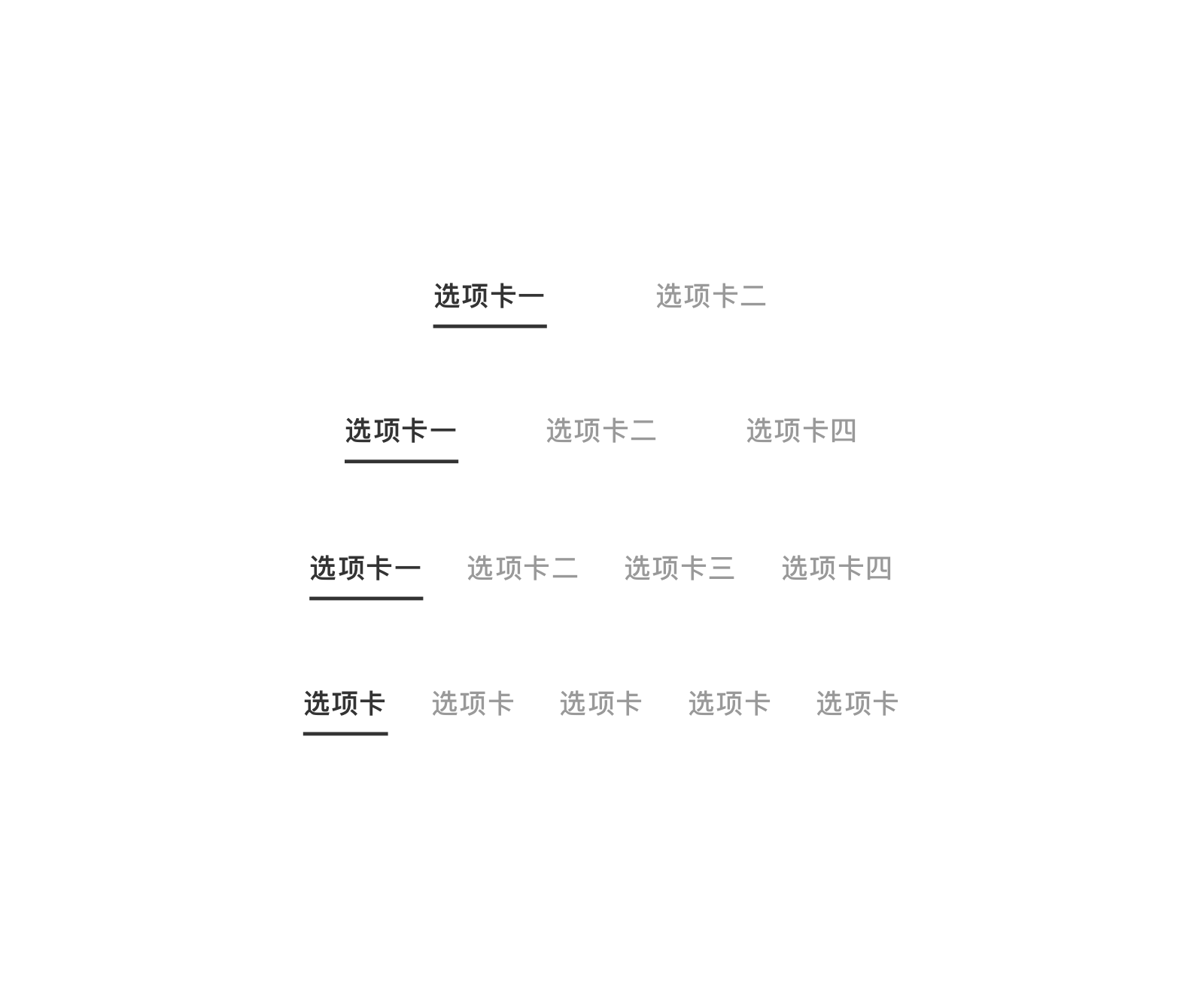
居中固定标签栏
所有标签在一个视图下全部展示,标签不能滚动。 其中,两个与三个标签的情况下,标签命名推荐不超过五个字;四个字标签的情况下,标签命名推荐不超过过四个字;五个标签情况下,标签命名推荐不超过三个字。 无特殊需求的情况下,标签栏推荐使用居中样式。
<up-tabs :padding-item="30" :items="['选项卡','选项卡']"></up-tabs>

<up-tabs :padding-item="29" :items="['选项卡','选项卡','选项卡']"></up-tabs>

<up-tabs :padding-item="18" :items="['选项卡','选项卡','选项卡','选项卡']"></up-tabs>

<up-tabs :items="['三个字','三个字','三个字','三个字','三个字']"></up-tabs>
constructor(props) {
	super(props);
	this.barItemsTwo = ['支出', '收入'];
	this.barItemsThree = ['标签标题', '标签标题', '标签标题'];
	this.barItemsFour = ['标签标题', '标签标题', '标签标题', '标签标题'];
	this.barItemsFive = ['文字一', '文字二', '文字三', '文字四', '文字五'];

	Object.assign(this.state, {
		activeIndexFixed: 0,
	});
}

renderPage() {
	return(
		<Label text='固定标签个数 两个标签 居中对齐' type='title' style={{flex:1, padding: Theme.spaceS}}/>

		<Tabs
		type={'fixed'}
		activeIndex={activeIndexFixed}
		onTabSelected={indexFixed => this.onTabChanged(indexFixed)}>
			{this.barItemsTwo.map((item, activeIndexFixed) => <Tabs.Item key={'item' + activeIndexFixed} title={item} />)}
		</Tabs>

		<Label text='固定标签个数 三个标签 居中对齐' type='title' style={{flex:1, padding: Theme.spaceS}}/>
		<Tabs
		type={'fixed'}
		activeIndex={activeIndexFixed}
		onTabSelected={indexFixed => this.onTabChanged(indexFixed)}>
			{this.barItemsThree.map((item, activeIndexFixed) => <Tabs.Item key={'item' + activeIndexFixed} title={item} />)}
		</Tabs>

		<Label text='固定标签个数 四个标签 居中对齐' type='title' style={{flex:1, padding: Theme.spaceS}}/>
		<Tabs
		type={'fixed'}
		activeIndex={activeIndexFixed}
		onTabSelected={indexFixed => this.onTabChanged(indexFixed)}>
			{this.barItemsFour.map((item, activeIndexFixed) => <Tabs.Item key={'item' + activeIndexFixed} title={item} />)}
		</Tabs>

		<Label text='固定标签个数 五个标签 居中对齐' type='title' style={{flex:1, padding: Theme.spaceS}}/>
		<Tabs
		type={'fixed'}
		activeIndex={activeIndexFixed}
		onTabSelected={indexFixed => this.onTabChanged(indexFixed)}>
			{this.barItemsFive.map((item, activeIndexFixed) => <Tabs.Item key={'item' + activeIndexFixed} title={item} />)}
		</Tabs>

		<Label text='固定标签个数 三个标签 靠左对齐' type='title' style={{flex:1, padding: Theme.spaceS}}/>
		<Tabs
		type={'fixed'}
		align='left'
		activeIndex={activeIndexFixed}
		onTabSelected={indexFixed => this.onTabChanged(indexFixed)}>
			{this.barItemsThree.map((item, activeIndexFixed) => <Tabs.Item key={'item' + activeIndexFixed} title={item} />)}
		</Tabs>

		<Label text='固定标签个数 三个标签 靠右对齐' type='title' style={{flex:1, padding: Theme.spaceS}}/>
		<Tabs
		type={'fixed'}
		align='right'
		activeIndex={activeIndexFixed}
		onTabSelected={indexFixed => this.onTabChanged(indexFixed)}>
			{this.barItemsThree.map((item, activeIndexFixed) => <Tabs.Item key={'item' + activeIndexFixed} title={item} />)}
		</Tabs>
	);
}
居左固定标签栏
所有标签在一个视图下全部展示,标签不能滚动。 如标签栏右侧需要放置重要操作,可考虑使用居左标签栏,标签数量推荐在三个以内。

<up-tabs position="left" :items="['选项卡一','选项卡二']"></up-tabs>
constructor(props) {
	super(props);
	this.barItemsThree = ['标签标题', '标签标题', '标签标题'];

	Object.assign(this.state, {
		activeIndexFixed: 0,
	});
}

renderPage() {
	return(
		<Label text='固定标签个数 三个标签 靠左对齐' type='title' style={{flex:1, padding: Theme.spaceS}}/>
		<Tabs
		type={'fixed'}
		align='left'
		activeIndex={activeIndexFixed}
		onTabSelected={indexFixed => this.onTabChanged(indexFixed)}>
			{this.barItemsThree.map((item, activeIndexFixed) => <Tabs.Item key={'item' + activeIndexFixed} title={item} />)}
		</Tabs>
	);
}
居右固定标签栏
所有标签在一个视图下全部展示,标签不能滚动。 如标签栏左侧需要放置重要操作,可考虑使用居右标签栏,标签数量推荐在三个以内。

<up-tabs position="right" :items="['选项卡一','选项卡二']"></up-tabs>
constructor(props) {
	super(props);
	this.barItemsThree = ['标签标题', '标签标题', '标签标题'];

	Object.assign(this.state, {
		activeIndexFixed: 0,
	});
}

renderPage() {
	return(
		<Label text='固定标签个数 三个标签 靠右对齐' type='title' style={{flex:1, padding: Theme.spaceS}}/>
		<Tabs
		type={'fixed'}
		align='right'
		activeIndex={activeIndexFixed}
		onTabSelected={indexFixed => this.onTabChanged(indexFixed)}>
			{this.barItemsThree.map((item, activeIndexFixed) => <Tabs.Item key={'item' + activeIndexFixed} title={item} />)}
		</Tabs>
	);
}
滑动标签栏
当一组标签选项过多(超过五个)或者名字过长时,可使用滑动标签栏,用户通过向左或向右滑动标签栏查看所有标签。

<up-tabs type="scrollable" :items="['不固定长度','选项二','选项三','选项四','选项五','选项六','选项七']" @onTabSelected="onTabSelected"></up-tabs>
constructor(props) {
	super(props);
	this.barScrollItems = ['餐饮','交通','日用','娱乐','医疗','教育','金融','服务','其他',];
	Object.assign(this.state, {
		activeIndexScrollable: 1);
	}
}

renderPage() {
	return (
		<Tabs
			type={'scrollable'}
			activeIndex={activeIndexScrollable}
			onTabSelected={indexScrollable => this.onTabChanged(indexScrollable)}>
			{this.barScrollItems.map((item, indexScrollable) => <Tabs.Item key={'item' + indexScrollable} title={item} />)}
		</Tabs>
	)
}
应用场景
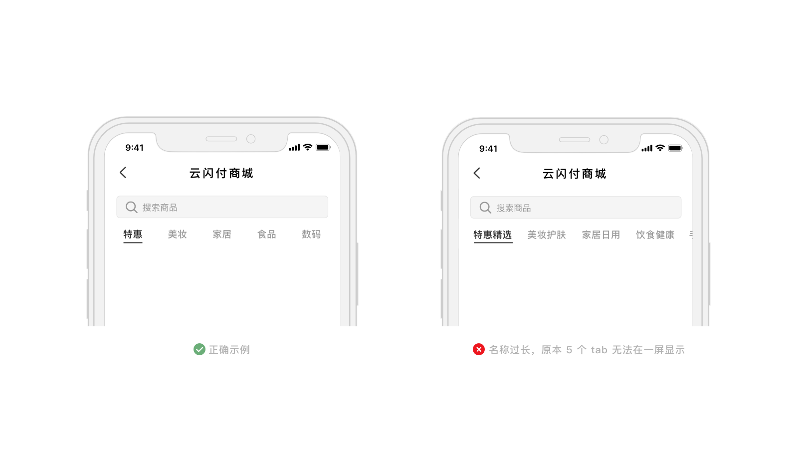
- 应在命名时控制标签栏文字的长度和数量,使标签栏尽量在屏幕内可以完全展示。
- 标签栏默认使用居中对齐形式,当标签栏位于内容中切换部分内容,或者右侧需要放置重要操作时,标签栏可以使用居左对齐形式。
Vue.js Reference
| 属性 | 说明 | 类型 | 可选值 | 默认值 |
|---|---|---|---|---|
| type | 标签页类型,fixed为固定不可滚动,scorllable为可滚动 | String | fixed,scrollable |
fixed |
| active | 默认选中的选项 | Number | - | 0 |
| position | 选项的位置 | String | left,center,right |
center |
| padding-item | 标签项左右边距 | Number | - | 12 |
| background-color | 标签页背景色 | String | white 白色,gray5 #f5f5f5 |
white |
| items | 选项数据 | Array | - | - |
| 事件 | 说明 | 参数 |
|---|---|---|
| onTabSelected | 选项卡改变时触发 | index: Number |
React Native Reference
Tabs
| 属性 | 说明 | 类型 | 可选值 | 默认值 |
|---|---|---|---|---|
| type | 标签栏类型,fixed为固定不可滚动、scorllable为可滚动 |
String | fixed,scrollable |
fixed |
| align | 选项的位置 | String | left,center,right |
center |
| paddingItem | 标签项左右边距 | Number | - | 12 |
| 事件 | 说明 | 参数 |
|---|---|---|
| onTabSelected | 选项卡改变时触发 | index: Number |
Tabs.Item
| 属性 | 说明 | 类型 | 可选值 | 默认值 |
|---|---|---|---|---|
| key | 键值 | String | - | - |
| title | 选项名称 | String | - | - |