界面组件 UI Components
弹窗 Modal
弹窗是出现在 App 内容图层之上的窗口,用于向用户说明关键信息。 弹窗出现时禁用 App 所有功能,需用户点击确认或取消方可消失。 另外在一些情况下,用户可点击弹窗外区域消除弹窗。
适用情况
- 考虑到弹窗对 App 其他功能的干扰性,须谨慎使用弹窗
- 在需要传递重要信息时使用弹窗
- 弹窗上须有确认或消除按钮
不适用情况
- 频繁使用弹窗
- 弹窗遮挡所有页面信息
- 点击弹窗按钮触发另一个弹窗的情况
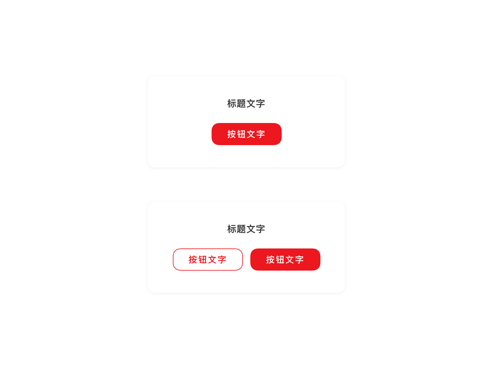
简单弹窗
简单弹窗由标题、确认键和/或取消键组成。标题下可用简短文字说明弹窗意图。
<up-modal
title='标题文字'
:confirmBtn="confirmBtn"
v-model="visible1"
>
<up-modal
title='标题文字'
:confirmBtn="confirmBtn"
:cancelBtn="confirmBtn"
v-model="visible2"
>
<up-modal
title='标题文字'
:confirmBtn="confirmBtn"
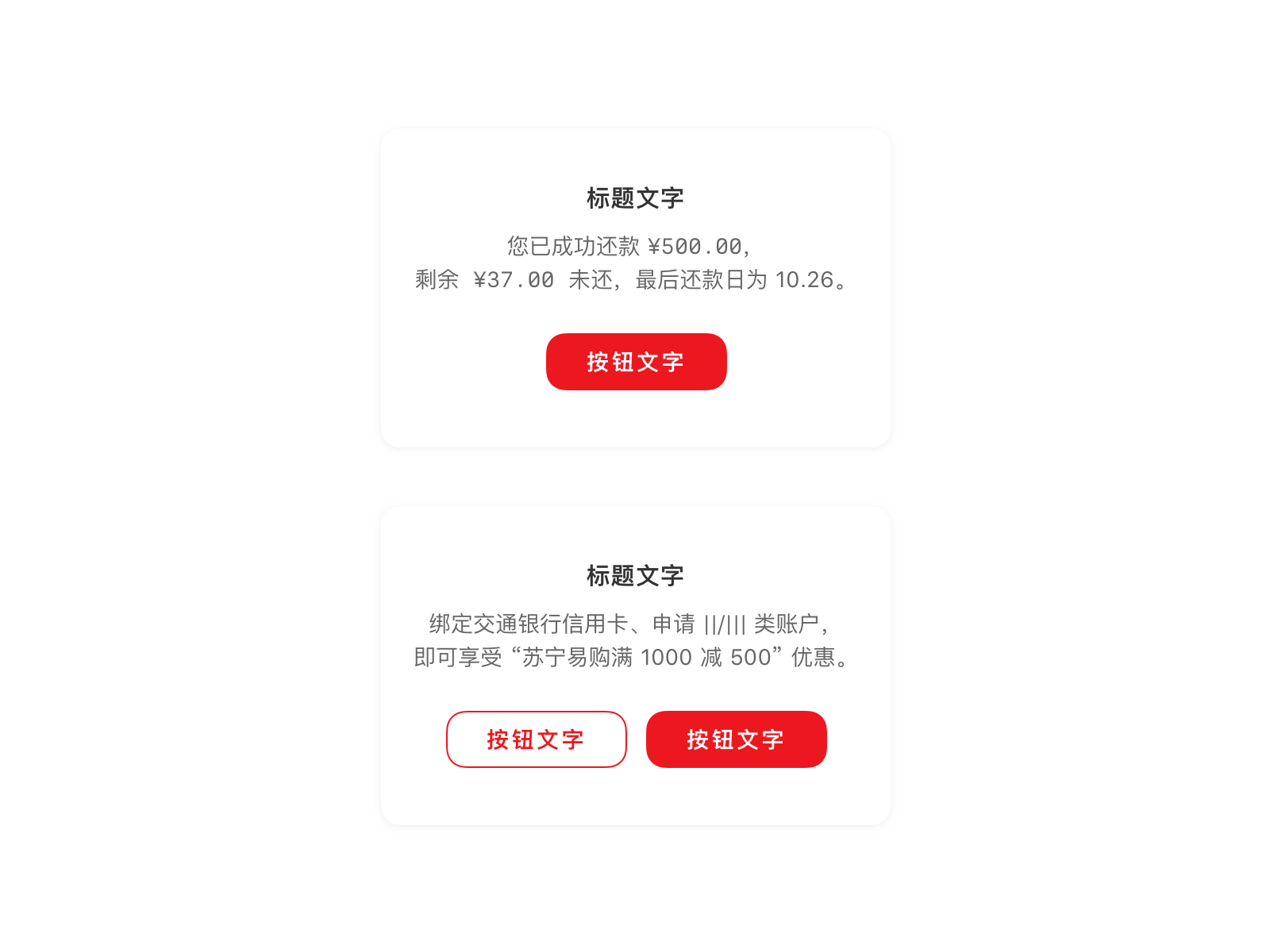
content="您已成功还款 ¥500.00,<br>剩余 ¥37.00 未还,最后还款日为 10.26。"
v-model="visible3"
>
<up-modal
title='标题文字'
:confirmBtn="confirmBtn"
:cancelBtn="confirmBtn"
content="马上绑定交通银行信用卡、申请||/|||类账户,即可享受 “苏宁易购满1000减500” 优惠。"
v-model="visible4"
>
</up-modal>
<script>
export default {
data () {
return {
confirmBtn:{
title: '按钮文字',
disabled: false,
},
cancelBtn:{
title: '按钮文字',
disabled: false,
},
visible1:false,
visible2:false,
visible3:false,
visible4:false,
}
}
}
</script>
showModal(title, content, confirmBtn, cancelBtn, input) {
	let overlayView = (
		<Overlay.View
			style={{alignItems: 'center', justifyContent: 'center'}}
			modal={true}
			overlayOpacity={null}
			ref={v => this._overlayView = v}>
			<Modal title={title} content={content}
				onConfirm={() => this._overlayView && this._overlayView.close()}
				onCancel={() => this._overlayView && this._overlayView.close()}
				confirmBtn={confirmBtn}
				cancelBtn={cancelBtn}
				input={input}
			/>
		</Overlay.View>);
		Overlay.show(overlayView);
	}

renderPage() {
    return (
      <ScrollView style={{flex:1, paddingHorizontal:Theme.spaceM,paddingTop:Theme.spaceM}}>
        <ListSection>
          <ListRow title='标题+单按钮' onPress={() => this.showModal('标题文字', null, '按钮文字', null)}/>
          <ListRow title='标题+双按钮' onPress={() => this.showModal('标题文字', null, '确认按钮', '取消按钮')}/>
        </ListSection>

        <ListSection>
          <ListRow title='标题+文字+单按钮' onPress={() => this.showModal('标题文字', '马上绑定交通银行信用卡、申请 I/II 类账户,即可享受 苏宁易购满 1000 减 500 优惠。', '确认按钮', null)}/>
          <ListRow title='标题+文字+双按钮' onPress={() => this.showModal('标题文字', '马上绑定交通银行信用卡、申请 I/II 类账户,即可享受 苏宁易购满 1000 减 500 优惠。', '确认按钮', '取消按钮')}/>
        </ListSection>
        <View style={{height: Theme.screenInset.bottom}} />
      </ScrollView>
    );
  }
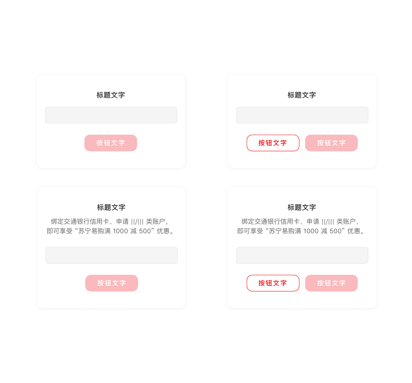
输入弹窗
输入弹窗需用户在输入框中键入所需信息方可进行下一步动作。输入框格式可以是数字输入、文字输入或者密码输入。
<up-modal
	title='标题文字'
	:confirmBtn="confirmBtn5"
	:input="input5"
	v-model="visible5"
>
</up-modal>
<up-modal
	title='标题文字'
	:confirmBtn="confirmBtn6"
	:cancelBtn="confirmBtn"
	:input="input6"
	v-model="visible6"
	>
</up-modal>
<up-modal
	title='标题文字'
	content='马上绑定交通银行信用卡、申请||/|||类账户,即可享受 “苏宁易购满1000减500” 优惠。'
	:confirmBtn="confirmBtn7"
	:input="input7"
	v-model="visible7"
	>
</up-modal>
<up-modal
	title='标题文字'
	content='马上绑定交通银行信用卡、申请||/|||类账户,即可享受 “苏宁易购满1000减500” 优惠。'
	:confirmBtn="confirmBtn8"
	:cancelBtn="confirmBtn"
	:input="input8"
	v-model="visible8"
	>
</up-modal>
<script>
export default {
	data () {
		return {
			cancelBtn:{
				title: '按钮文字',
				disabled: false,
			},
			confirmBtn5:{
				title: '按钮文字',
				disabled: true,
			},
			confirmBtn6:{
				title: '按钮文字',
				disabled: true,
			},
			confirmBtn7:{
				title: '按钮文字',
				disabled: true,
			},
			confirmBtn8:{
				title: '按钮文字',
				disabled: true,
			},
			input5:{
				text:"",
				placeholder:"占位文字"
			},
			input6:{
				text:"",
				placeholder:"占位文字"
			},
			input7:{
				text:"",
				placeholder:"占位文字"
			},
			input8:{
				text:"",
				placeholder:"占位文字"
			},
			visible5:false,
			visible6:false,
			visible7:false,
			visible8:false,
		}
	}
}
</script>
showModal(title, content, confirmBtn, cancelBtn, input) {
	let overlayView = (
		<Overlay.View
			style={{alignItems: 'center', justifyContent: 'center'}}
			modal={true}
			overlayOpacity={null}
			ref={v => this._overlayView = v}>
			<Modal title={title} content={content}
				onConfirm={() => this._overlayView && this._overlayView.close()}
				onCancel={() => this._overlayView && this._overlayView.close()}
				confirmBtn={confirmBtn}
				cancelBtn={cancelBtn}
				input={input}
			/>
		</Overlay.View>);
		Overlay.show(overlayView);
	}

renderPage() {
    return (
      <ScrollView style={{flex:1, paddingHorizontal:Theme.spaceM,paddingTop:Theme.spaceM}}>
        <ListSection>
          <ListRow title='标题+输入框+单按钮' onPress={() => this.showModal('标题文字', null, '确认按钮', null, (<Input style={{height: 33}} placeholder='输入文字内容'/>))}/>
          <ListRow title='标题+输入框+双按钮' onPress={() => this.showModal('标题文字', null, '确认按钮', '取消按钮', (<Input style={{height: 33}} placeholder='输入文字内容'/>))}/>
        </ListSection>

        <ListSection>
        <ListRow title='标题+输入框+单按钮' onPress={() => this.showModal('标题文字', '马上绑定交通银行信用卡、申请 I/II 类账户,即可享受 苏宁易购满 1000 减 500 优惠。', '确认按钮', null, (<Input style={{height: 33}} placeholder='输入文字内容'/>))}/>
        <ListRow title='标题+输入框+双按钮' onPress={() => this.showModal('标题文字', '马上绑定交通银行信用卡、申请 I/II 类账户,即可享受 苏宁易购满 1000 减 500 优惠。', '确认按钮', '取消按钮', (<Input style={{height: 33}} placeholder='输入文字内容'/>))}/>
        </ListSection>

        <View style={{height: Theme.screenInset.bottom}} />
      </ScrollView>
    );
  }
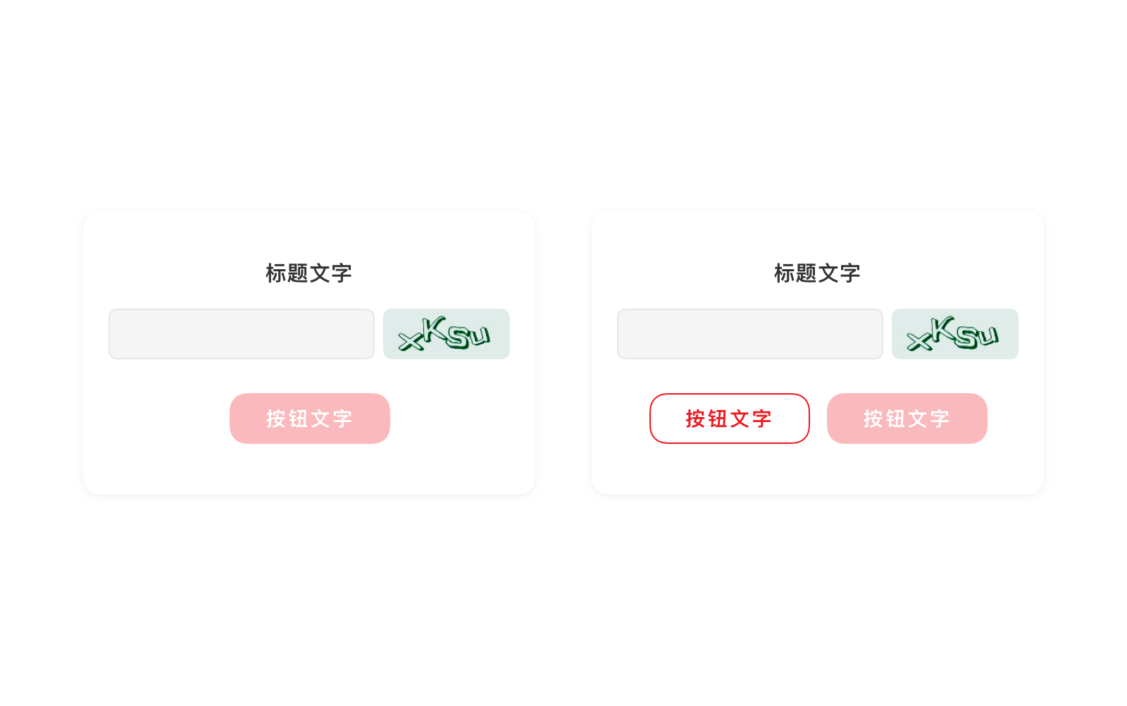
验证码弹窗
验证弹窗用于安全验证,需用户辨别出数字和字母输入验证框以确保界面前是人而非机器在操作。
<up-modal
	title='标题文字'
	:confirmBtn="confirmBtn9"
	:input="input9"
	v-model="visible9"
	@confirm="handleConfirm9"
	@changeCode="handleChangeCode9"
	@change="change9"
	>
	<div class="code" slot="code" @click="handleChangeCode10">
		<img :src="codeUrl9" alt="">
	</div>
</up-modal>
<up-modal
	title='标题文字'
	:confirmBtn="confirmBtn10"
	:cancelBtn="cancelBtn"
	:input="input10"
	v-model="visible10"
	@confirm="handleConfirm10"
	@cancel="handleCancel10"
	@changeCode="handleChangeCode10"
	@change="change10"
	>
	<div class="code" slot="code" @click="handleChangeCode10">
		<img :src="codeUrl10" alt="">
	</div>
</up-modal>

<script>
export default {
	data () {
		return {
			codeUrl9:require("../img/code_default.png"),
			codeUrl10:require("../img/code_default.png"),
			cancelBtn:{
				title: '按钮文字',
				disabled: false,
			},
			confirmBtn9:{
				title: '按钮文字',
				disabled: true,
			},
			confirmBtn10:{
				title: '按钮文字',
				disabled: true,
			},
			input9:{
				text:"",
				placeholder:"占位文字"
			},
			input10:{
				text:"",
				placeholder:"占位文字"
			},
			visible9:false,
			visible10:false,
		}
	},
	methods:{
		handleConfirm9(e,val){},
		handleChangeCode9(e){
			this.codeUrl9 = require("../img/code_default2.png");
		},
		change9(val){},
		handleConfirm10(e,val){},
		handleCancel10(e){},
		handleChangeCode10(e){
			this.codeUrl10 = require("../img/code_default2.png");
		}
		change10(val){},
	}
}
</script>
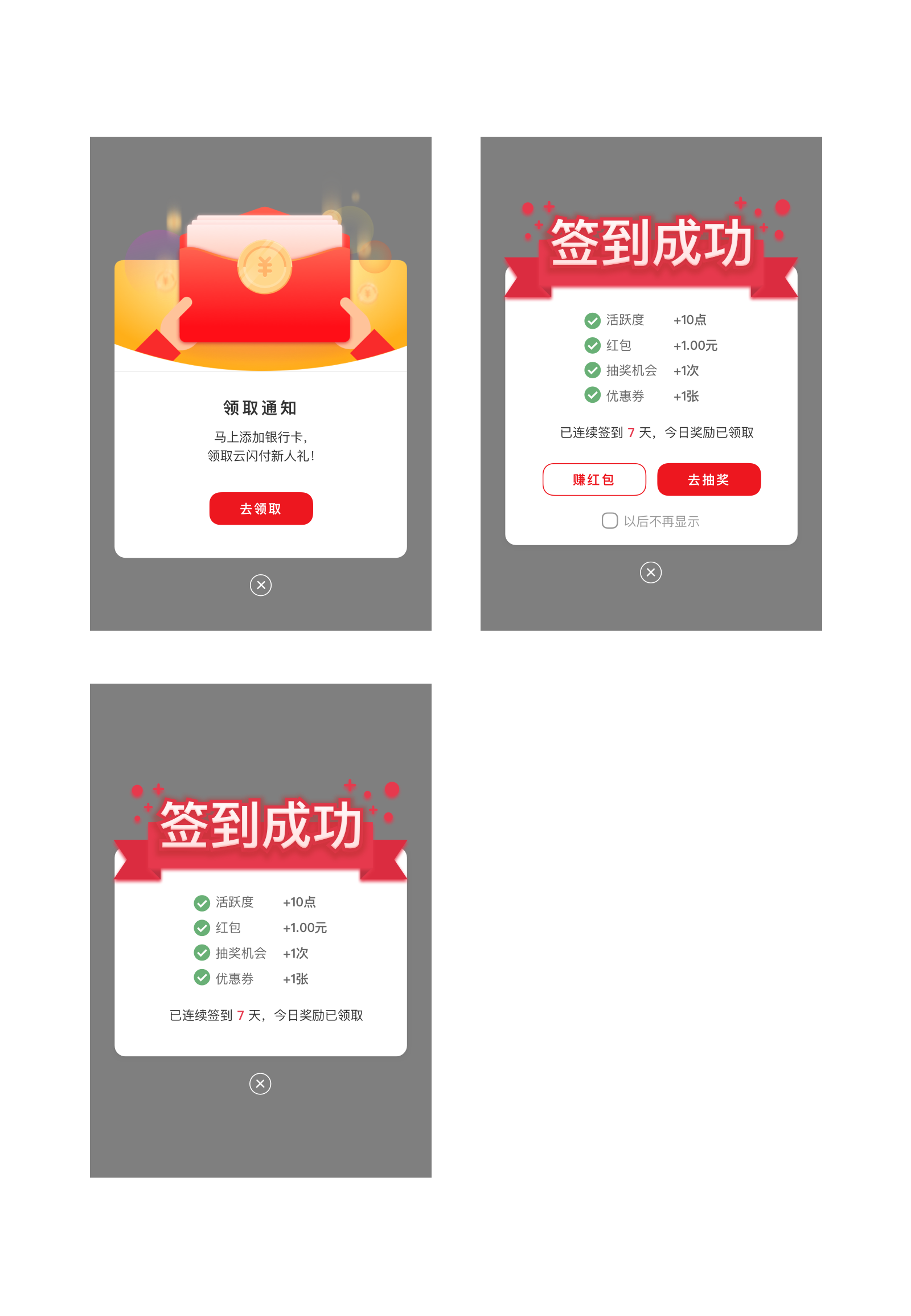
营销弹窗
营销弹窗是一种特殊的弹窗,仅用于强营销内容的展现。
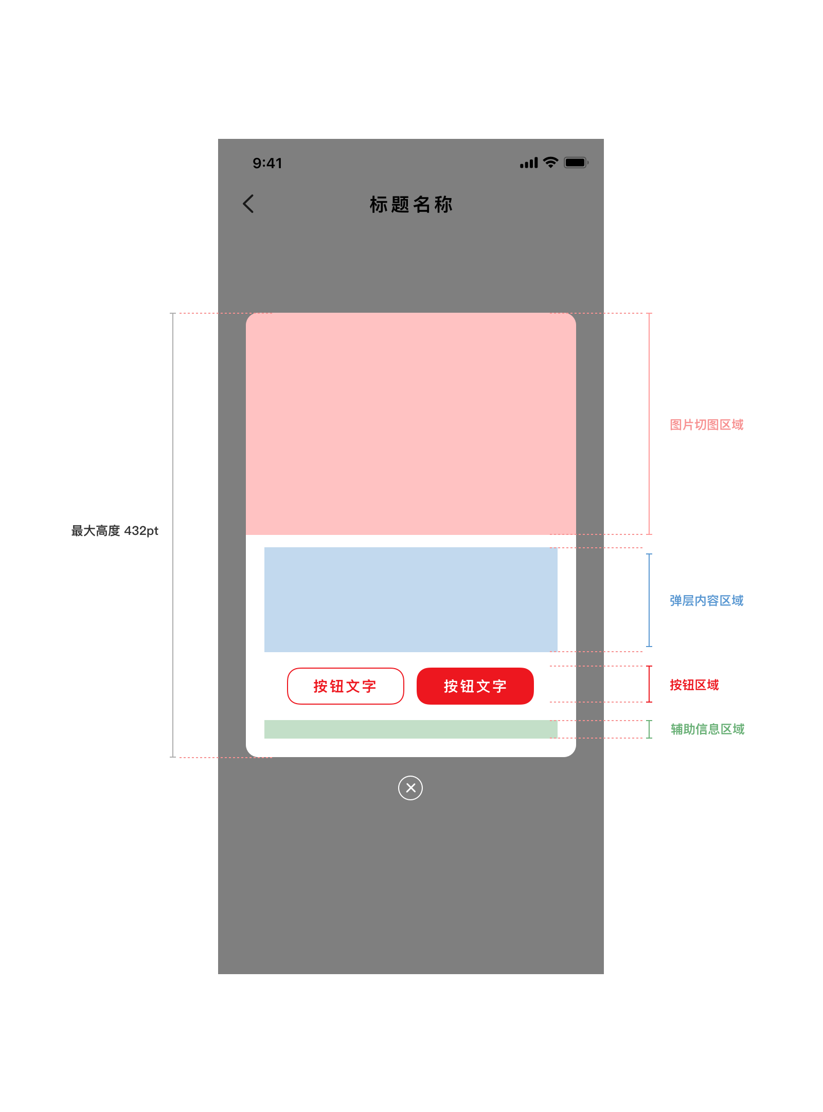
营销弹窗的组成部分由上到下分别为: 氛围图(必有)+ 内容(可选)+ 主次按钮(可选)+ 辅助信息(可选)+ 关闭(必有)
- 弹窗(关闭按钮除外)最大高度 432 pt
- 氛围图高度占弹窗总高度不超过 216pt,宽度等于弹窗宽度
- 内容区域高度占弹窗部分不限定,最大高度为弹窗最大高度 432 减去其余部分的高度,如果超出则出现滚动条
- 按钮可以为一个主要按钮,或者一个次要按钮(左)+一个主要按钮(右)
- 辅助信息高度为不超过 18pt,通常为一个 checkbox 加一段文字
具体设计切图规范参考组件库源文件。
以下为示例:
<up-modal
        type="marketing"
        :market-img-url="marketImgUrl"
        :confirmBtn="confirmBtn11"
        :cancelBtn="cancelBtn11"
        v-model="visible11"
        >
        <div slot="content" class="cot_market">
          <div class="title">领取通知</div>
          <div class="has-text-body desc">马上添加银行卡<br>领取云闪付新人礼</div>
        </div>
        <div slot="message" class="cot_message">
          <up-checkbox v-model="checkbox">以后不再显示</up-checkbox>
        </div>
</up-modal>

<script>
export default {
	data () {
		return {
			checkbox:false,
			marketImgUrl:require("../img/modal_marketing.png"),
			visible11:false,
			confirmBtn11:{
				title: '去领取',
				disabled: false,
			},
			cancelBtn11:{
				title: '赚红包',
				disabled: false,
			},
		}
	},
}
</script>
showModal(title, content, confirmBtn, cancelBtn, input, header, footer, hasCloseButton) {
	let overlayView = (
		<Overlay.View
		style={{alignItems: 'center', justifyContent: 'center'}}
		modal={true}
		overlayOpacity={null}
		ref={v => this._overlayView = v}
		>
			<Modal title={title} content={content}
			onConfirm={() => this._overlayView && this._overlayView.close()}
			onCancel={() => this._overlayView && this._overlayView.close()}
			confirmBtn={confirmBtn}
			cancelBtn={cancelBtn}
			input={input}
			header={header}
			footer={footer}
			hasCloseButton = {hasCloseButton}
			/>
		</Overlay.View>
	);
	Overlay.show(overlayView);
}

renderPage() {
	return (
		<ScrollView style={{flex:1, paddingHorizontal:Theme.spaceM,paddingTop:Theme.spaceM}}>
			<ListSection type='singleRow'>
				<ListRow title='营销弹窗' onPress={() =>
					this.showModal('领取通知', '马上添加银行卡\n领取云闪付新人礼', '去领取', '赚红包',
					null,
					(<Image key='icon' source={require('../img/modal_header.png')} />),
					(<Checkbox checked={this.state.cb0} title = '以后不再显示' onChange={() => this.setState({cb0: !this.state.cb0})} />),
					true
				)}/>
			</ListSection>
			<View style={{height: Theme.screenInset.bottom}} />
		</ScrollView>
	);
}
应用场景
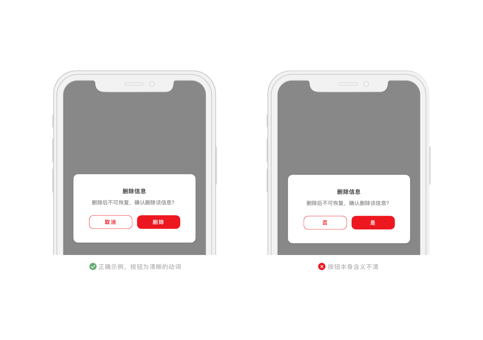
- 弹窗 (Modal) 中的按钮用词必须是明确的动词,请勿使用 “是” 或者 “否” 这类表意不清的词语。
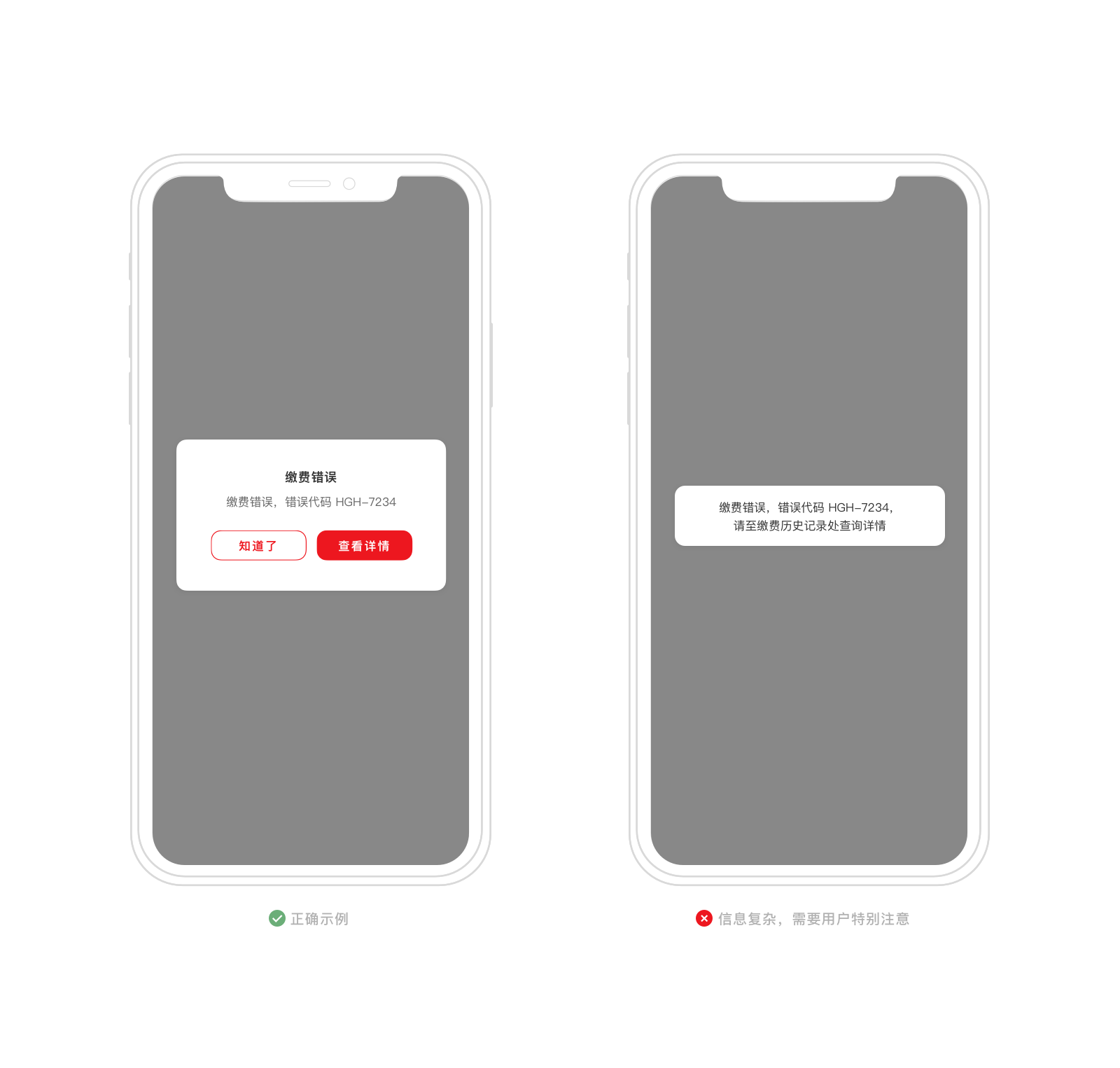
- 弹窗 (Modal) 在用做提醒用户消息时,仅用于需要用户特别留意的重要信息,如果是信息重要程度较低,请使用消息弹框 (Toast)。
Vue.js Reference
| 属性 | 说明 | 类型 | 可选值 | 默认值 |
|---|---|---|---|---|
| v-model | 显示状态,双向数据绑定 | Boolean | - | false |
| type | 弹窗类型 | String | default,marketing |
default |
| title | 标题 | String | - | - |
| content | 正文内容 | String | - | - |
| confirmBtn | 确认按钮参数配置 | Object | - | { title: '确定',disabled: false} |
| cancelBtn | 取消按钮参数配置,传入配置才会显示 | Object | - | { title: '取消',disabled: false} |
| input | 输入框参数配置,传入配置才会显示 | Object | - | { text: '',placeholder: ''} |
| market-img-url | 营销弹窗的页头图片url | String | - | - |
- confirmBtn 子配置项
| 属性 | 说明 | 类型 | 可选值 | 默认值 |
|---|---|---|---|---|
| title | 按钮文字 | String | - | 确认 |
| disabled | 是否禁用 | Boolean | - | false |
- cancelBtn 子配置项
| 属性 | 说明 | 类型 | 可选值 | 默认值 |
|---|---|---|---|---|
| title | 按钮文字 | String | - | 取消 |
| disabled | 是否禁用 | Boolean | - | false |
- input 子配置项
| 属性 | 说明 | 类型 | 可选值 | 默认值 |
|---|---|---|---|---|
| text | 输入框内容 | String | - | - |
| placeholder | 输入框提示文字 | Boolean | - | - |
- 插槽
| 名字 | 说明 | 参数 |
|---|---|---|
| code | slot=”code”时,显示验证码,插槽内应为验证码图片 | - |
| content | type=”marketing”且slot=”content”时,插入弹层内容区域 | - |
| message | type=”marketing”且slot=”message”时,插入辅助信息区域 | - |
- 事件
| 事件 | 说明 | 参数1 | 参数2 |
|---|---|---|---|
| confirm | 单击确定按钮触发 | 事件对象 e | 显示 input 时,输入的值 val |
| cancel | 单击取消按钮触发 | 事件对象 e | - |
| change | 输入框改变触发 | 事件对象 e | 显示 input 时,输入的值 val |
React Native Reference
Modal 的参数定义如下
| 属性 | 说明 | 类型 | 可选值 | 默认值 |
|---|---|---|---|---|
| title | 标题 | string | - | - |
| content | 正文内容 | string | - | - |
| confirmBtn | 确认按钮 | <Button/> 元素 |
- | - |
| cancelBtn | 取消按钮,传入才会显示 | <Button/> 元素 |
- | - |
| input | 输入框,传入才会显示 | <Input/> 元素 |
- | - |
| header | 营销弹窗的页头图片 | <Image/> 元素 |
- | - |
| footer | 营销弹窗的页脚控件 | <View/> 元素 |
- | - |
| hasCloseButton | 营销弹窗的关闭按钮显示控制 | bool | - | false |
| 事件 | 说明 |
|---|---|
| onConfirm | 单击确定按钮触发 |
| onCancel | 单击取消按钮触发 |