界面组件 UI Components
下拉菜单 Dropdown
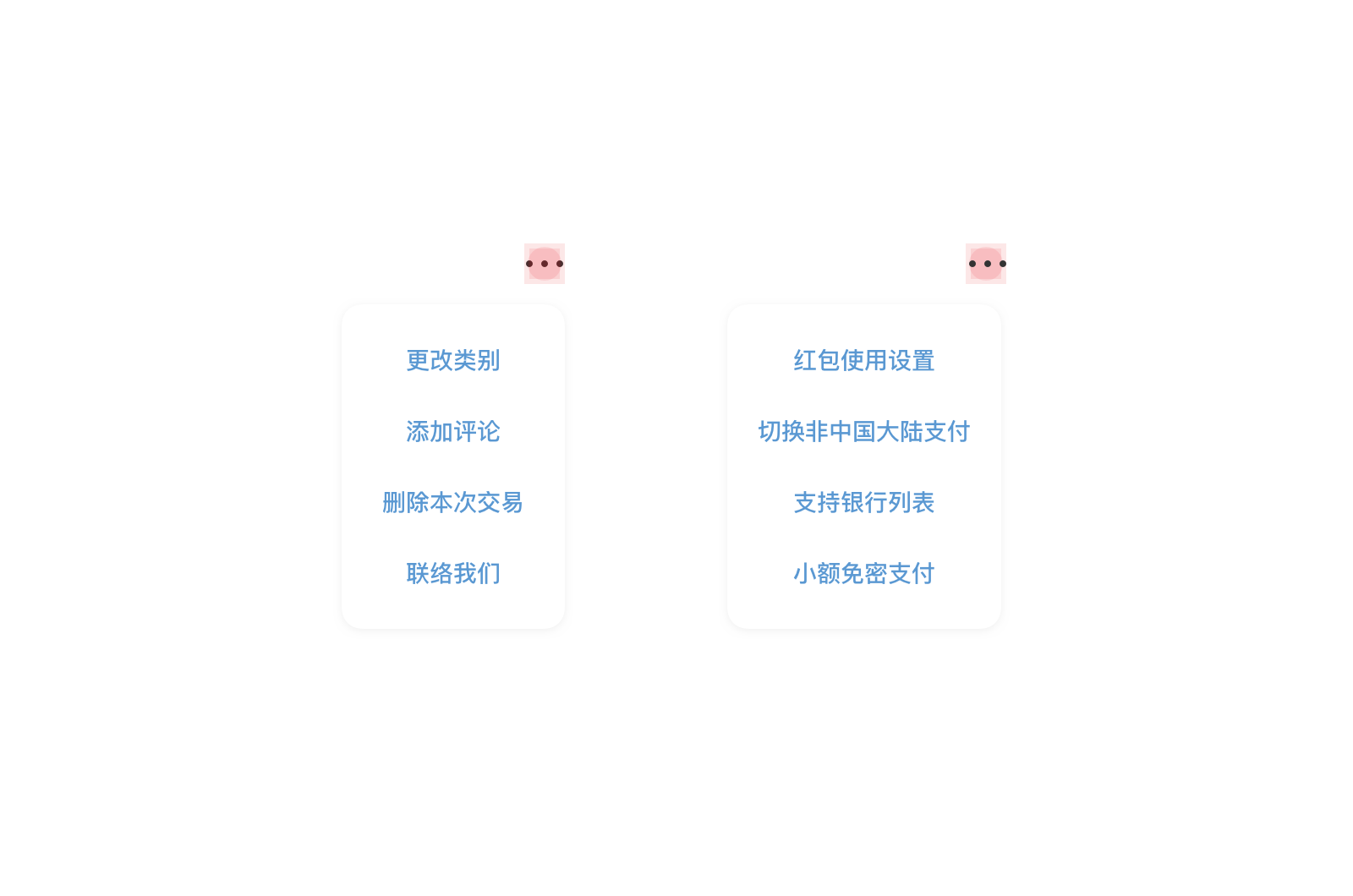
下拉菜单向用户呈现一组操作选项。当一个界面无法容纳所有选项,或者选项常用性不高时使用下拉菜单形式。 下拉菜单 (Dropdown) 仅用于 “···” (更多) 图标的情况上,且比起动作表 (Action Sheet) 来说下拉菜单 (Dropdown) 更加轻量,对用户操作打断较小,适用于希望用户快速进行下一步操作的情况。
适用情况
- 下拉菜单选项不应超过 6 项。
- 每个选项内容简短。
不适用情况
- 下拉菜单内出现图标等视觉元素。
- 菜单选项中出现多行文字的情况。
- 下拉菜单边框超出屏幕尺寸。
用户与界面元素互动后触发下拉菜单。根据触发元素的位置,下拉菜单可出现在其上或其下。 下拉菜单中选项应不超过 6 个;下拉菜单仅使用纯文字,避免使用图标。
<up-dropdown v-model="drop" width="100%" :items="items" @onSelected="onSelected">
	<div class="box></div>
</up-dropdown>

<script>

export default {
  data () {
    return {
      items:['更改类别','添加评论','删除该交易','联络我们'],
      drop:true,
    }
  },
  methods:{
    onSelected:function(ev){
      console.log(ev)
    },
  }
}
</script>
import {Dropdown} from 'up-qp-dls';

...

constructor(props) {
	super(props);
	this.items = [
	'更改类别',
	'添加评论',
	'删除该交易',
	'联系我们',];
	Object.assign(this.state, {
		selectedIndex: null,
	});
}

show(view) {
	view.measure((x, y, width, height, pageX, pageY) => {
	Dropdown.show(
			{x: pageX, y: pageY, width, height},
			this.items,
			this.state.selectedIndex,
			(item, index) => this.setState({selectedIndex: index})
		);
	});
}

renderPage() {
	let {selectedIndex} = this.state;
	let selected = (selectedIndex || selectedIndex === 0) ? this.items[selectedIndex] : this.items[0];

	return (
		<ScrollView style={{flex:1, paddingHorizontal:Theme.spaceM,paddingTop:Theme.spaceM}}>
		<ListSection type='singleRow'>
		<ListRow title='触发下拉菜单' detail={selected} ref='defaultRow' onPress={() => this.show(this.refs['defaultRow'])} />
		</ListSection>

		<Button title={selected} type='primary' ref='primaryButton' onPress={() => this.show(this.refs['primaryButton'])} />

		<View style={{height: Theme.screenInset.bottom}} />
		</ScrollView>
	);
}

...
应用场景
- 下拉菜单 (Dropdown) 仅用于 “···” (更多) 图标的情况上,且比起动作表 (Action Sheet) 来说下拉菜单 (Dropdown) 更加轻量,对用户操作打断较小,适用于希望用户快速进行下一步操作的情况。 动作表适用性更广,但也对用户下一步操作打断更大,使用时候应根据实际情况选择动作表 (Action Sheet) 或是下拉菜单 (Dropdown) 。

Vue.js Reference
| 属性 | 说明 | 类型 | 可选值 | 默认值 |
|---|---|---|---|---|
| v-model | 显示状态,双向数据绑定 | Boolean | - | false |
| width | 菜单宽度,可以写固定数值(数字或百分比,需带单位)或自适应(auto) | String | - | auto |
| items | 菜单项配置 | Array | - | - |
| position | 菜单整体位置 | String | left,center,right |
right |
| 事件 | 说明 | 参数 |
|---|---|---|
| onSelected | 选择菜单选项时触发 | index: Number |
React Native Reference
Dropdown.show() 函数的参数说明
| 参数 | 说明 | 类型 | 可选值 | 默认值 |
|---|---|---|---|---|
| fromBounds | 下拉菜单展开的起始位置 | JSON配置参数 {x: 0, y: 0, width:114, height:48} |
- | - |
| items | 菜单项文字 | string 数组 | - | - |
| selectedIndex | 默认选中的菜单项索引值 | integer | - | -1 |
| onSelected | 选中时触发的回调函数 | - | func | - |