视觉规范 Visual Guidelines
间距 Spacing
有规律地安排内容间的距离,是创造秩序和韵律的关键。 间距部分亦使用了数字 3 作为变化的基础单位,6 作为变化的推荐单位。
实际在使用时候,不应仅仅从视觉角度考虑单个元素之间的间距,同时也应该从开发实现的角度考虑开发实现的逻辑,从而综合定义界面元素的间距。
基础固定间距
基础固定间距以 6 为单位,使用 6 的倍数定义基础间距,定义如下:
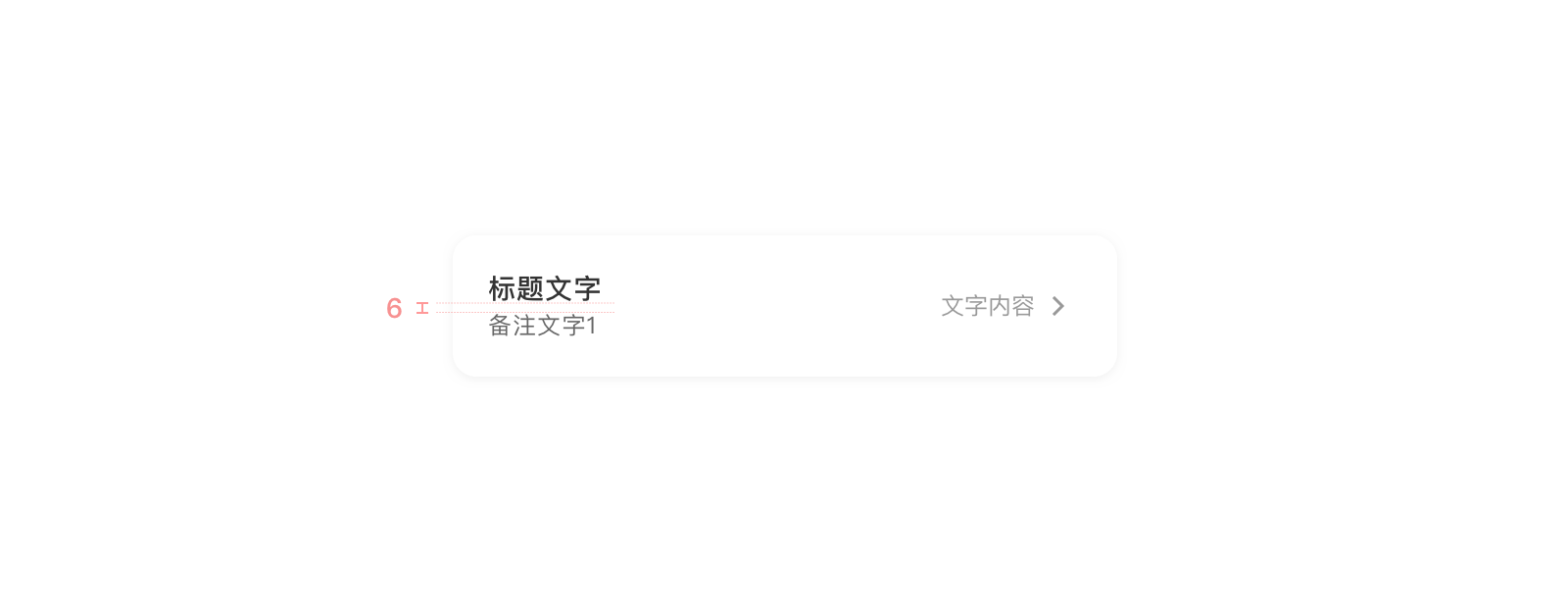
XS: 6 (文字内容的上下间距)
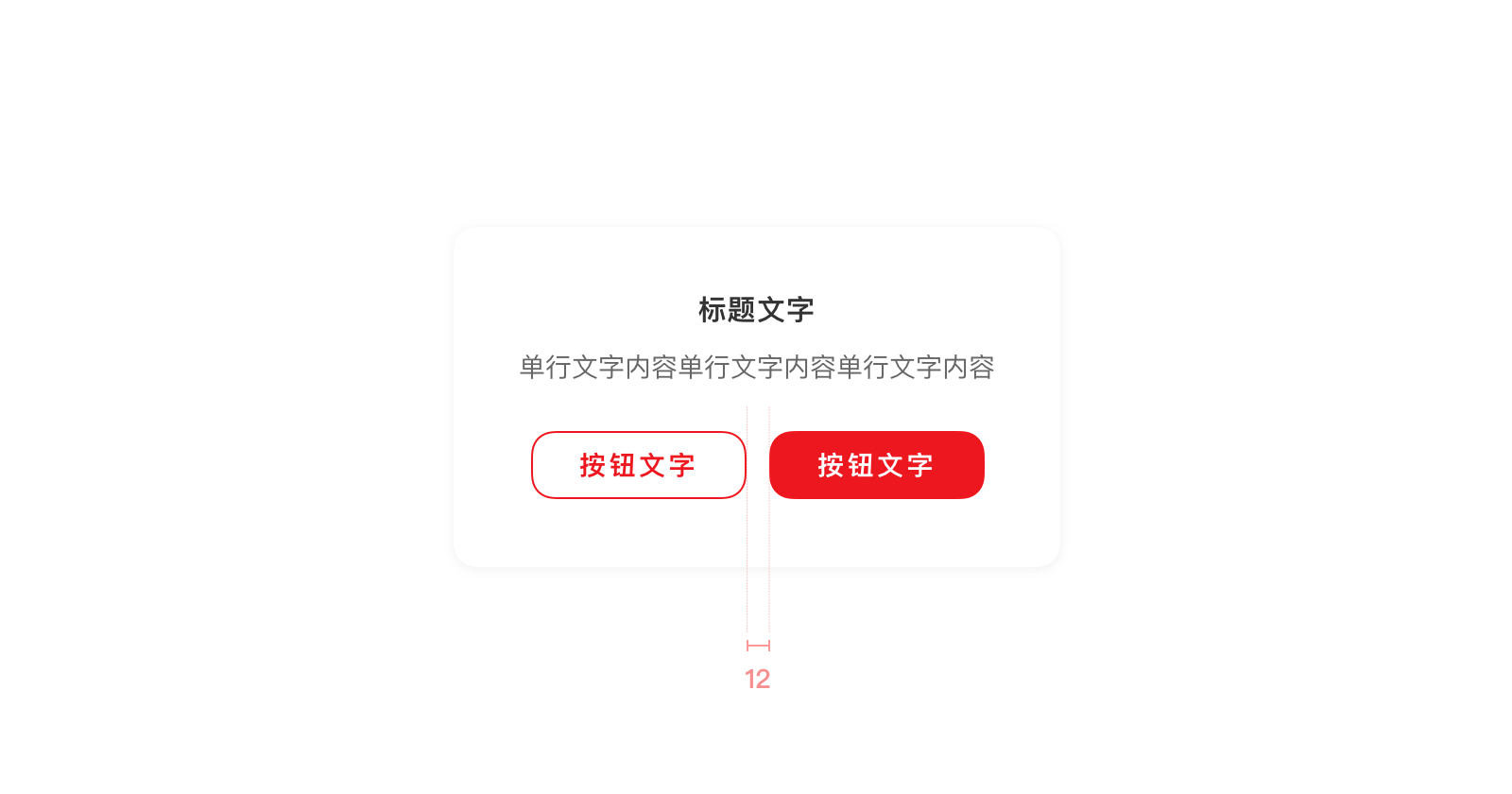
S: 12 (小区块中,内容的左右间距)
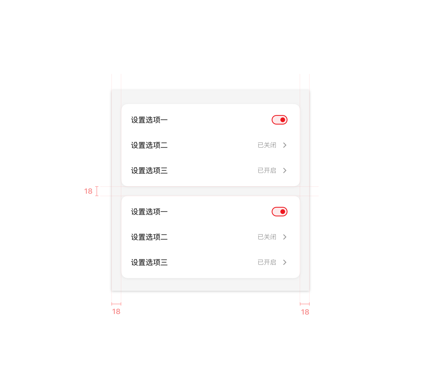
M: 18 (内容与屏幕的左右间距、大卡片与屏幕/另一张大卡片的上下间距、小区块中内容与小区块卡片的左右间距)
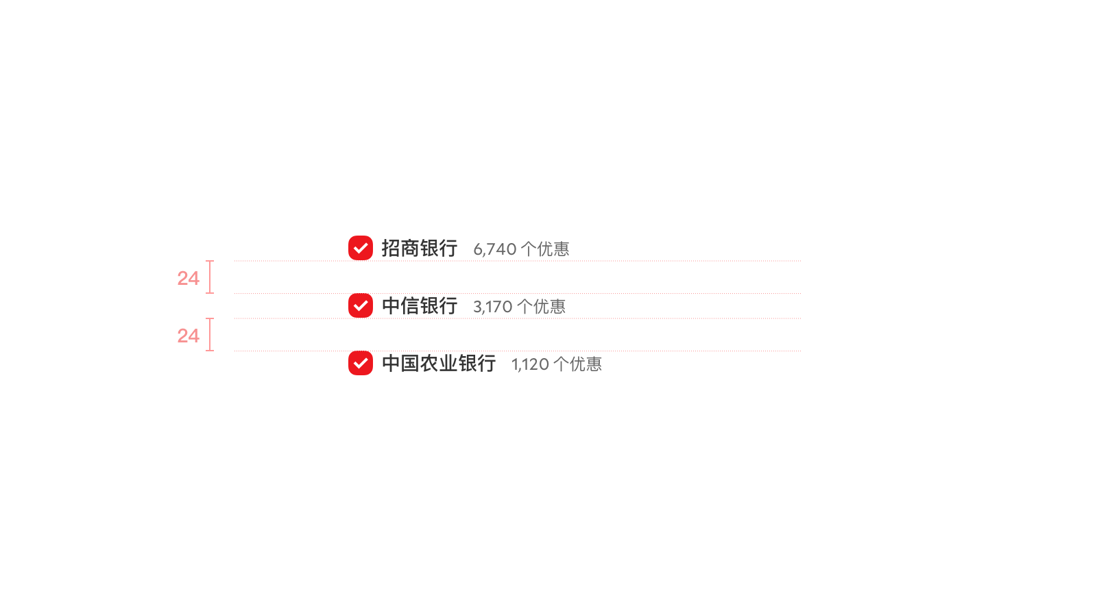
L:24 (同一区块下,不同小区快的间距)
XL:36 (用于区分不同大区块地间距)

布局时应尽量使用上述距离,如果上述距离均不满足使用,应尽量选择使用 6 的倍数作为间距。
如果 6 的倍数不符合实际需求,则应尽量选择 3 的倍数,如 3、9 等。
应用场景
以下为页面示例,可以看到,各部分元素均以 3 的倍数作为间距标准,且大部分情况下会使用到上面所述的间距。
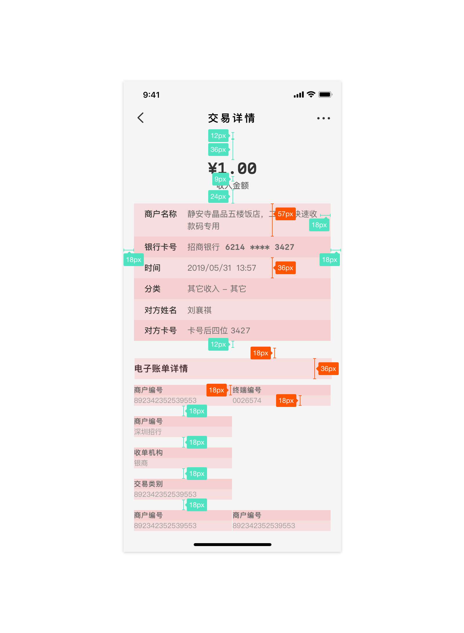
更多案例可以于组件库文件中查看。
Vue.js Reference
设计系统中的基础间距大小已经定义为对应的CSS类,不同的间距定义具体如下:
| 属性 | 说明 | 内间距class | 外间距class |
|---|---|---|---|
| XS | 特小间距 | has-padd-top-XS,has-padd-left-XS,has-padd-right-XS,has-padd-bottom-XS,has-padd-XS,has-padd-topBottom-XS,has-padd-leftRight-XS |
has-margin-top-XS,has-margin-left-XS,has-margin-right-XS,has-margin-bottom-XS,has-margin-XS,has-margin-topBottom-XS,has-margin-leftRight-XS |
| S | 小间距 | has-padd-top-S,has-padd-left-S,has-padd-right-S,has-padd-bottom-S,has-padd-S,has-padd-topBottom-S,has-padd-leftRight-S |
has-margin-top-S,has-margin-left-S,has-margin-right-S,has-margin-bottom-S,has-margin-S,has-margin-topBottom-S,has-margin-leftRight-S |
| M | 中间距 | has-padd-top-M,has-padd-left-M,has-padd-right-M,has-padd-bottom-M,has-padd-M,has-padd-topBottom-M,has-padd-leftRight-M |
has-margin-top-M,has-margin-left-M,has-margin-right-M,has-margin-bottom-M,has-margin-M,has-margin-topBottom-M,has-margin-leftRight-M |
| L | 大间距 | has-padd-top-L,has-padd-left-L,has-padd-right-L,has-padd-bottom-L,has-padd-L,has-padd-topBottom-L,has-padd-leftRight-L |
has-margin-top-L,has-margin-left-L,has-margin-right-L,has-margin-bottom-L,has-margin-L,has-margin-topBottom-L,has-margin-leftRight-L |
| XL | 特大间距 | has-padd-top-XL,has-padd-left-XL,has-padd-right-XL,has-padd-bottom-XL,has-padd-XL,has-padd-topBottom-XL,has-padd-leftRight-XL |
has-margin-top-XL,has-margin-left-XL,has-margin-right-XL,has-margin-bottom-XL,has-margin-XL,has-margin-topBottom-XL,has-margin-leftRight-XL |
React Native Reference
设计语言中的基础间距大小已经定义为 Theme 内的常量值,可以通过 Theme.spaceXS 的方式来引用,举例如下:
import {Theme} from 'up-qp-dls';

<View style={{height: Theme.spaceM}} />
不同的间距定义具体如下:
| 属性 | 说明 | 引用方式 |
|---|---|---|
| XS | 特小间距 | Theme.spaceXS |
| S | 小间距 | Theme.spaceS |
| M | 中间距 | Theme.spaceM |
| L | 大间距 | Theme.spaceL |
| XL | 特大间距 | Theme.spaceXL |